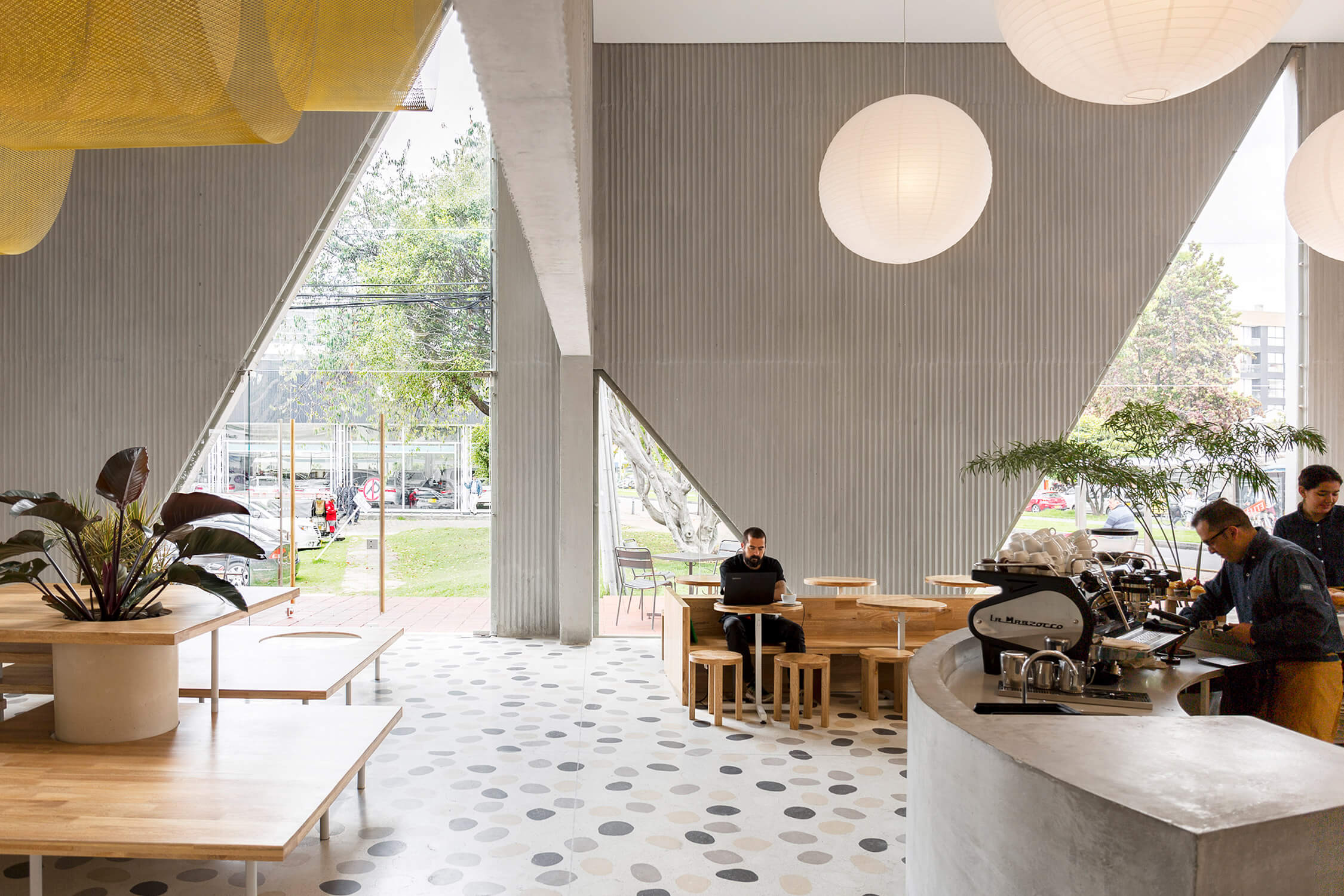
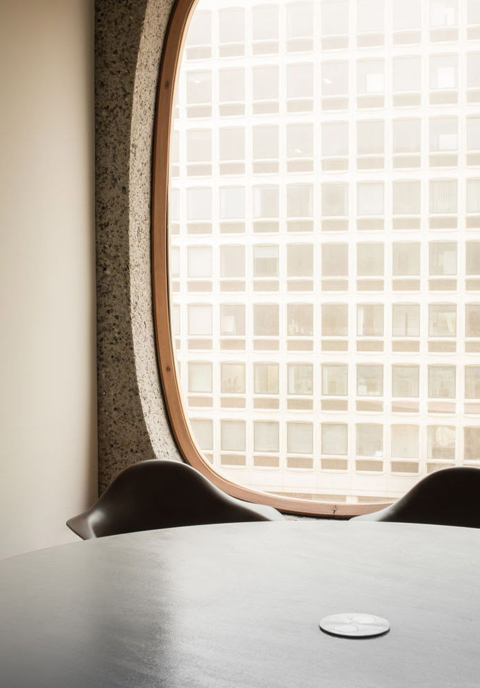
It isn’t immediately evident that Masa, an upscale-casual eatery in Bogota, was formerly a private residence. But as one approaches the 7,500-square-foot béton brut restaurant, a residential vibe becomes clearer. Masa is comprised of interconnected volumes, each with different functions. Its massive triangular cut-out windows, which beg visitors to peer within, offer a balance of voyeurism and privacy.
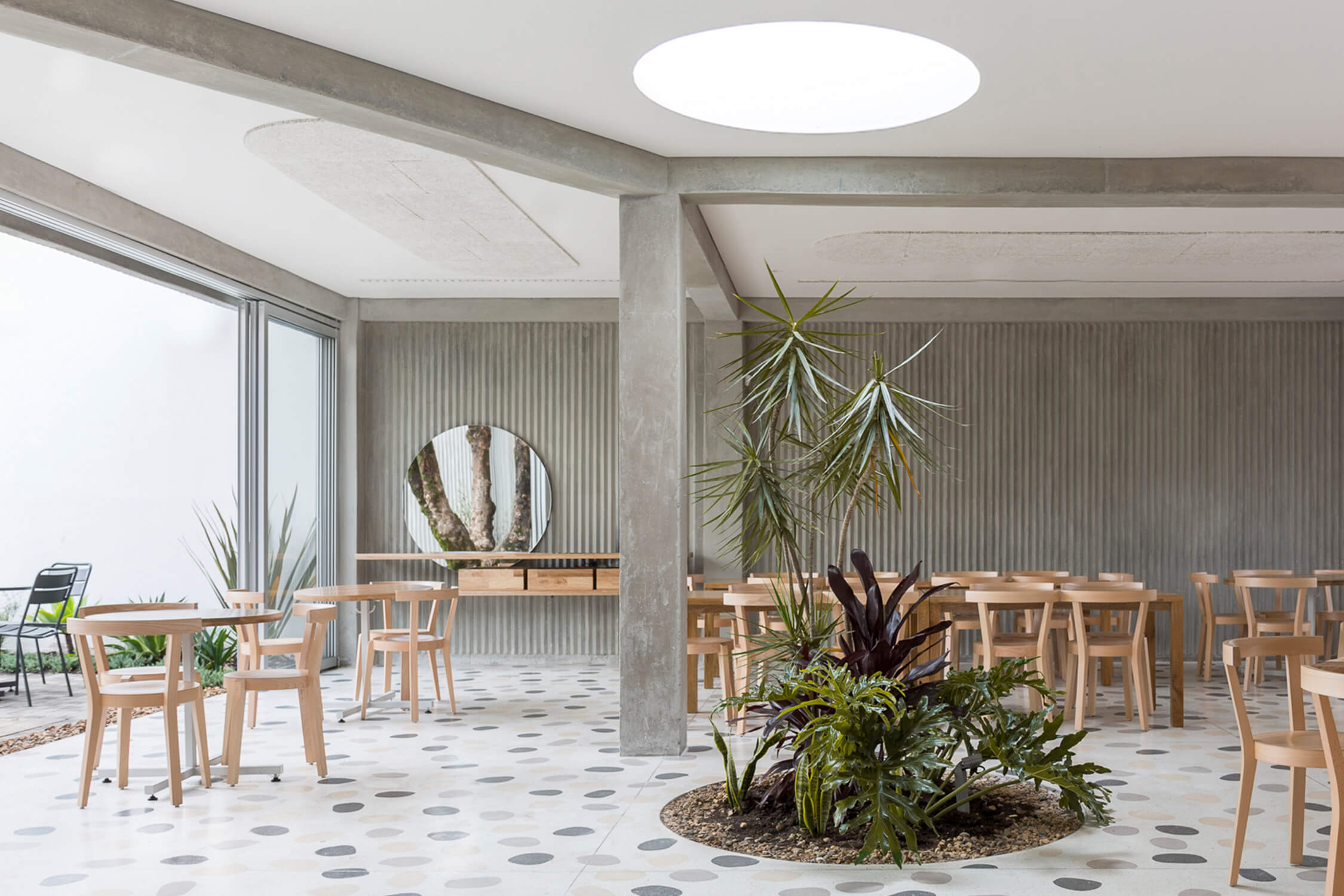
Local practice Studio Cadena divided the volumes into a series of distinct rooms, drawing visitors through spaces filled with custom lighting, furniture and outdoor spaces. Lead designer Benjamin Cadena defined these spaces with eye-catching graphic elements. Reinterpreting the language of Masa’s window, he created an interior filled with playful geometry: custom-made paper globes and swaths off hand-painted metal mesh cascade from the ceiling, cast-in-place concrete walls are etched with parallel lines, bold terrazzo floors are used throughout, and service stations of concrete and wood – either in rectangular or cylindrical forms – dot the restaurant. Porthole windows are inserted throughout, providing a view of the kitchen hustle. Indeed, there’s graphic intrigue on offer, but none of it is loud enough to overshadow the building itself. And that’s the point. “The strategy from a design standpoint,” says Cadena, “is that the building does the work.”
Why we like it: A concrete building filled with geometric forms risks being overwhelmingly austere. But here, Cadena used the material to create a playful restaurant that’s equal parts private and welcoming.
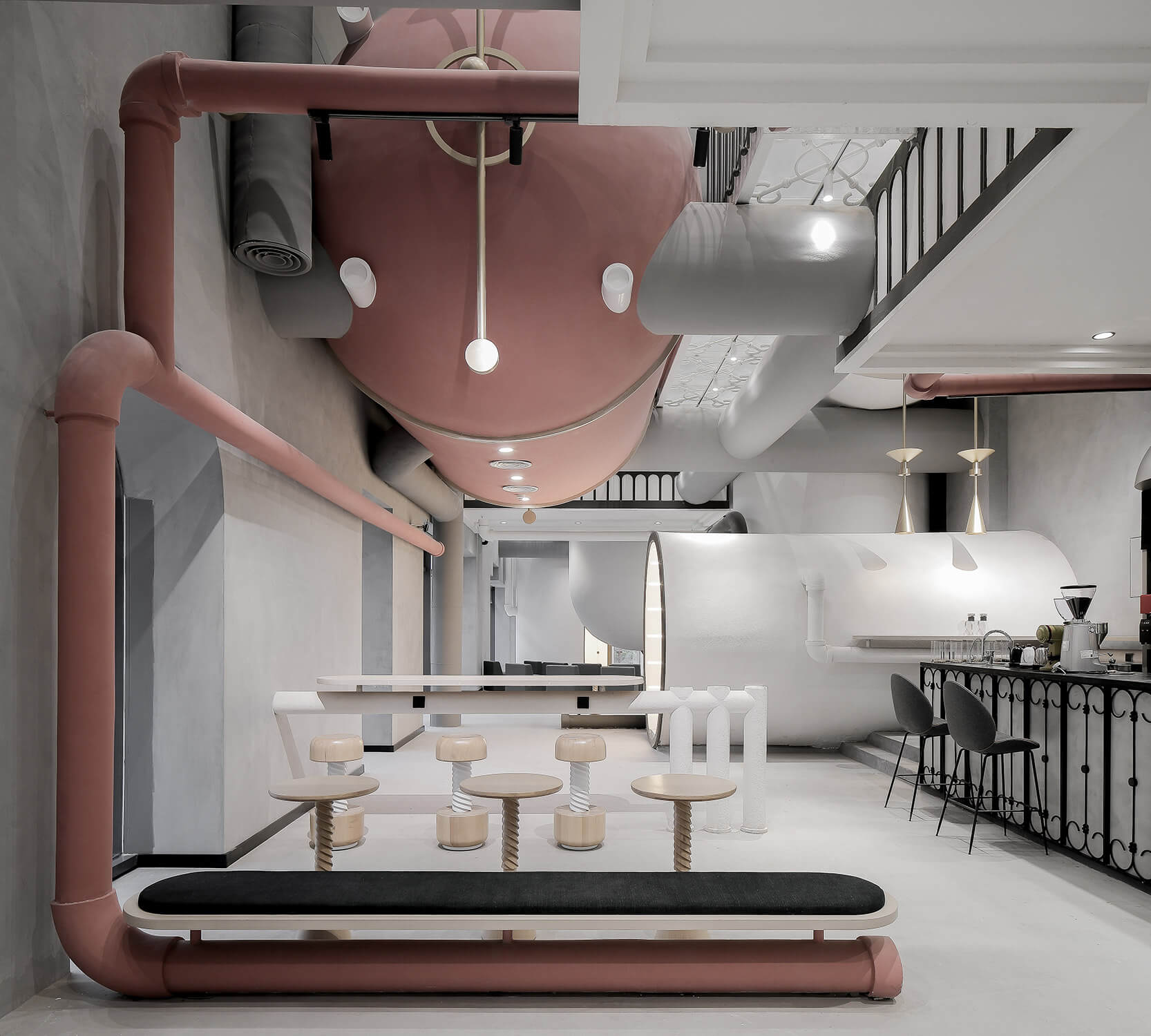
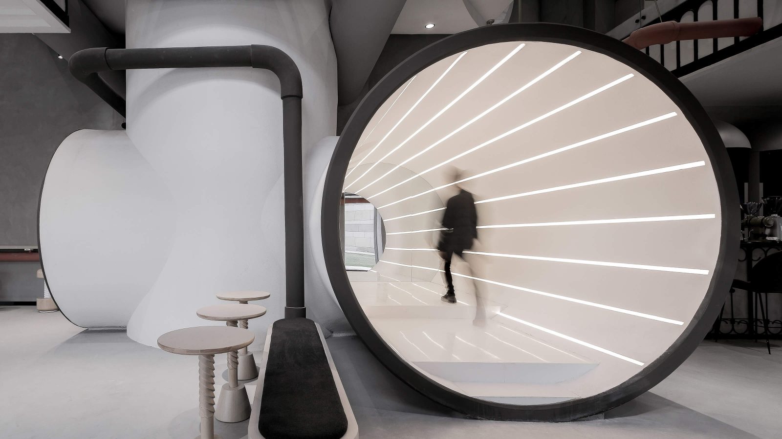
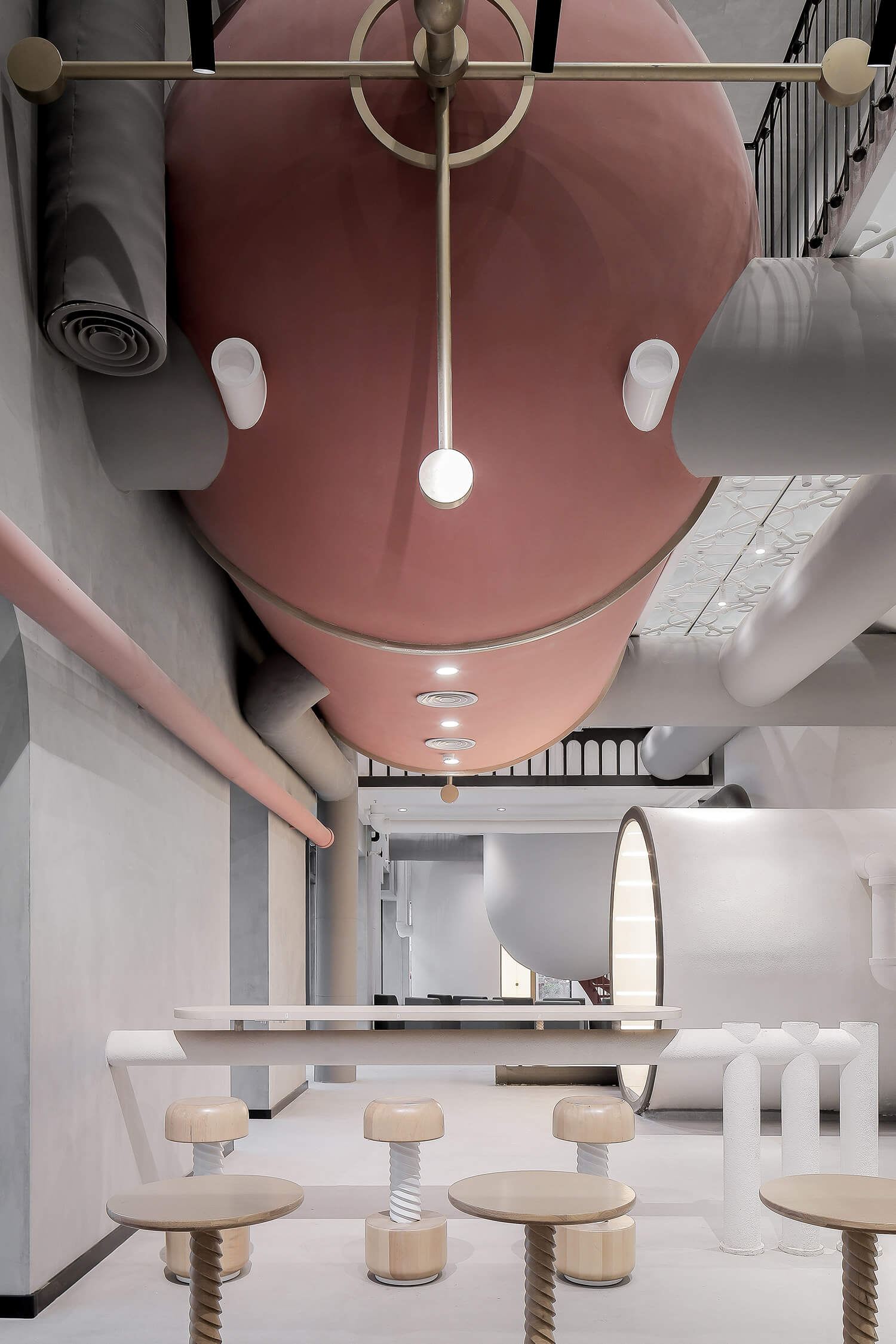
Shanghai interdisciplinary studio X+Living has built a name on their colourful, highly experimental interiors – and their take on industrial-inspired workspaces for Ideas Lab may be their best project yet. Designed as a flexible office-retail space for Powerlong Group, a mega-company that is involved in everything from real estate to the arts, Ideas Lab hearkens back to the steam era without delving into gaudy steampunk: pink and white pipes draw the eye to cylindrical volumes suspended from the ceiling, while communal tables are adorned with stool perched upon corkscrew-like bases. But despite the abundant unpolished concrete – which can be found on walls and flooring throughout – X+Living also filled Ideas Lab with soft curves, translucent glass railings and a rosy spiral staircase, which provides a welcome balance to all that straight-laced industrialism. Ideas Lab is many things, but a factory it ain’t.
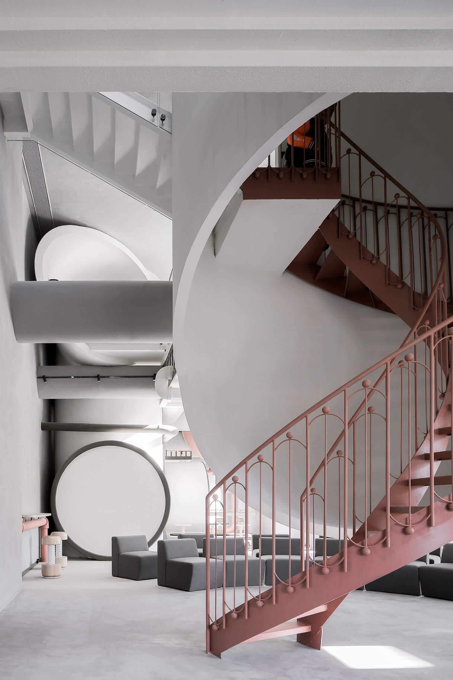
Finally, for a touch of Star Wars-esque futurism, the studio installed a cylindrical walkway lined with LED strips because, hey, it isn’t an X+Living project without a splash of whimsy.
Why we like it: For all the industrial-inspired projects that land our our desks (or our inboxes), few are as inspired – or as playful – as this one.
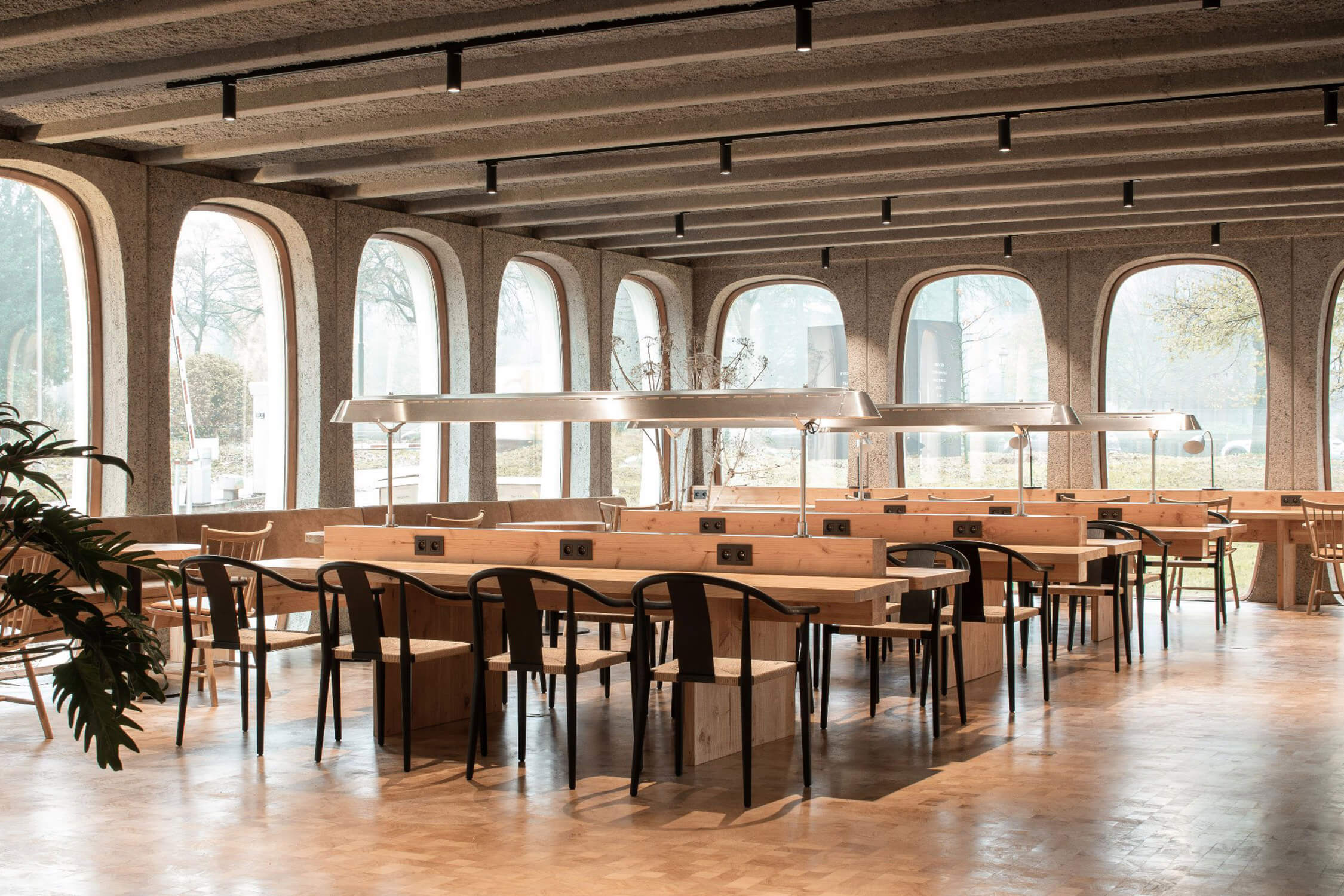
When developing interiors for a building as striking as the former headquarters of CBR cement – whose facade is constructed from 756 convex concrete modules that frame distinctive oblong windows – there’s palpable pressure to get things right. But Going East delivered with its second large-scale coworking space for Fosbury & Sons in Boitsfort, Brussels. Occupying 7,000 square metres spread over seven floors, the building features amenities common to these types of shared spaces: there’s a bar at the lobby level, private offices, communal work areas, a pool table, a restaurant and inspiring art (provided here by Rodolphe Janssen and Veerle Verbakel).
But the bells and whistles aren’t what impress here. Rather, it’s the fact that every space – whether private, public or used for play – is framed by the memorable windows, aggregate concrete walls and the building’s original trusses. The sleek wooden tables, grand terrazzo staircases and discrete charging stations are distinctly contemporary, but the views from those windows – which, on the higher floors, offer panoramic views of the Sonian forest – point to the timelessness of its Brutalist skin.
Why we like it: This Brussels coworking space may look like the office of the future, but it’s deeply entrenched in the workspaces of the past.
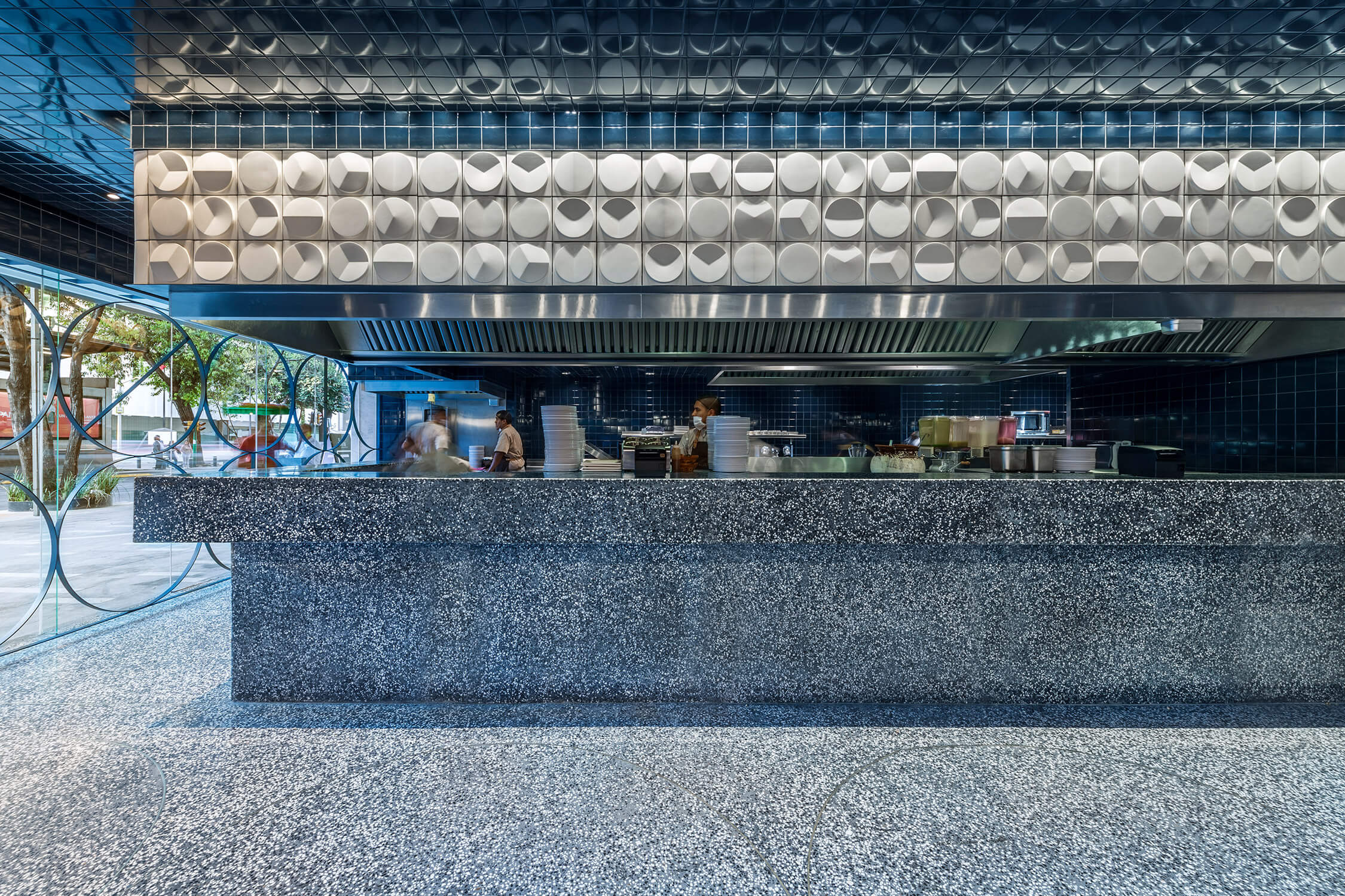
Tacos are humble masterpieces as both unassailable street food and delectable opportunities for high-end experimentation. And in this crisp white-and-blue space, which won the 2018 AZ Award for best commercial interior, the simple form of the taco itself is both celebrated and elevated. Mexico City firm Esrawe Studio covered the walls with tortilla-size ceramic circles, each tile creased one way or another to show the infinite ways people fold and hold their tacos. Overhead, reflective blue ceramic tiles create an enveloping ambiance, almost like being submerged in a pool of water, while indigo-hued terrazzo on the floor is embellished with extra-large rings in gold.
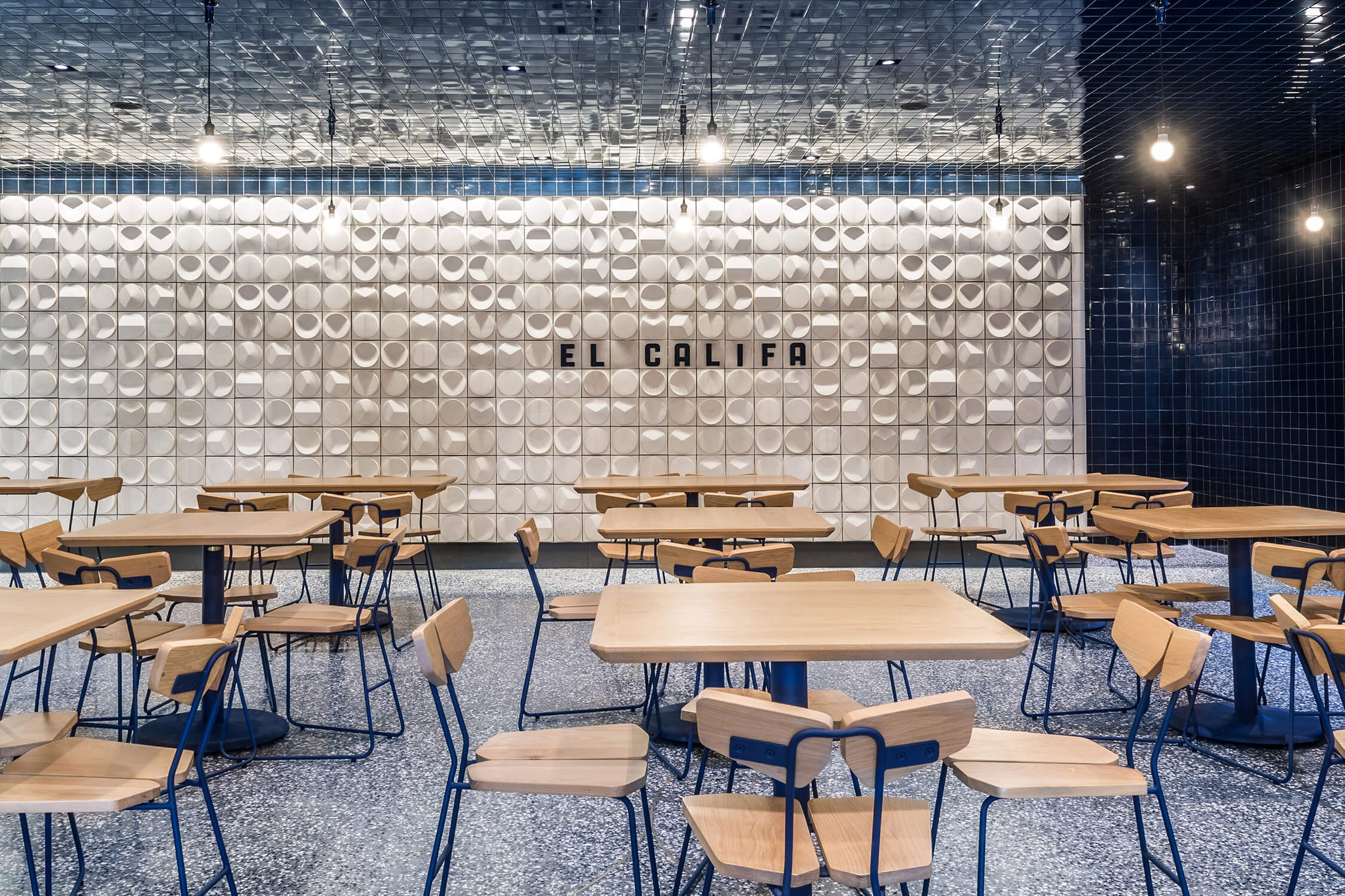
Completing this inviting space are custom wooden tables and chairs – butterfly-shaped seats and backrests allow diners to lean back and take in the atmosphere as chefs serve up dishes from the open kitchen – and glazed walls that seamlessly connect the space to the street.
Why we like it: Allen Chan, a juror for the 2018 AZ Awards, said it best: “This is arguably the best taco shop I’ve ever seen.”
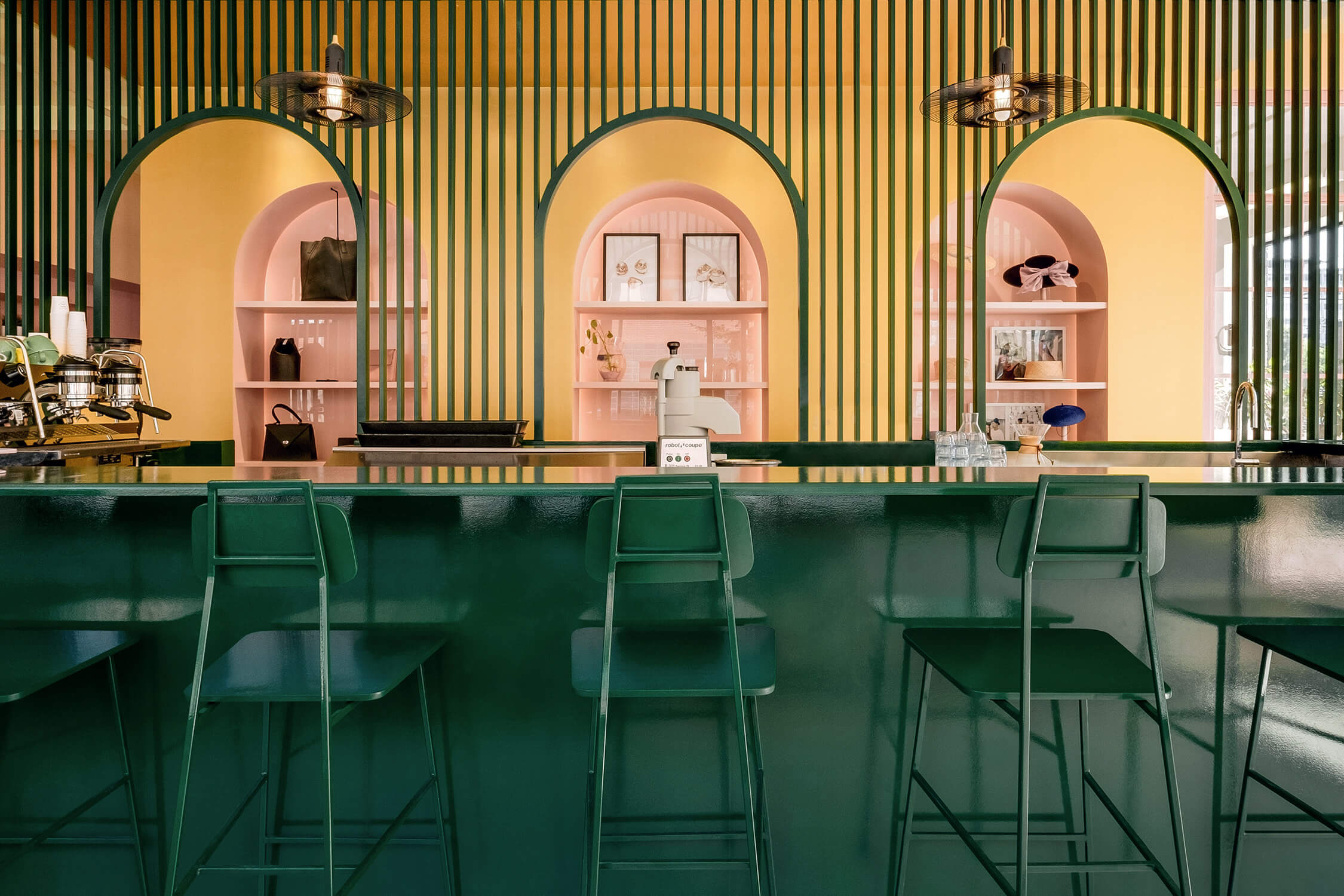
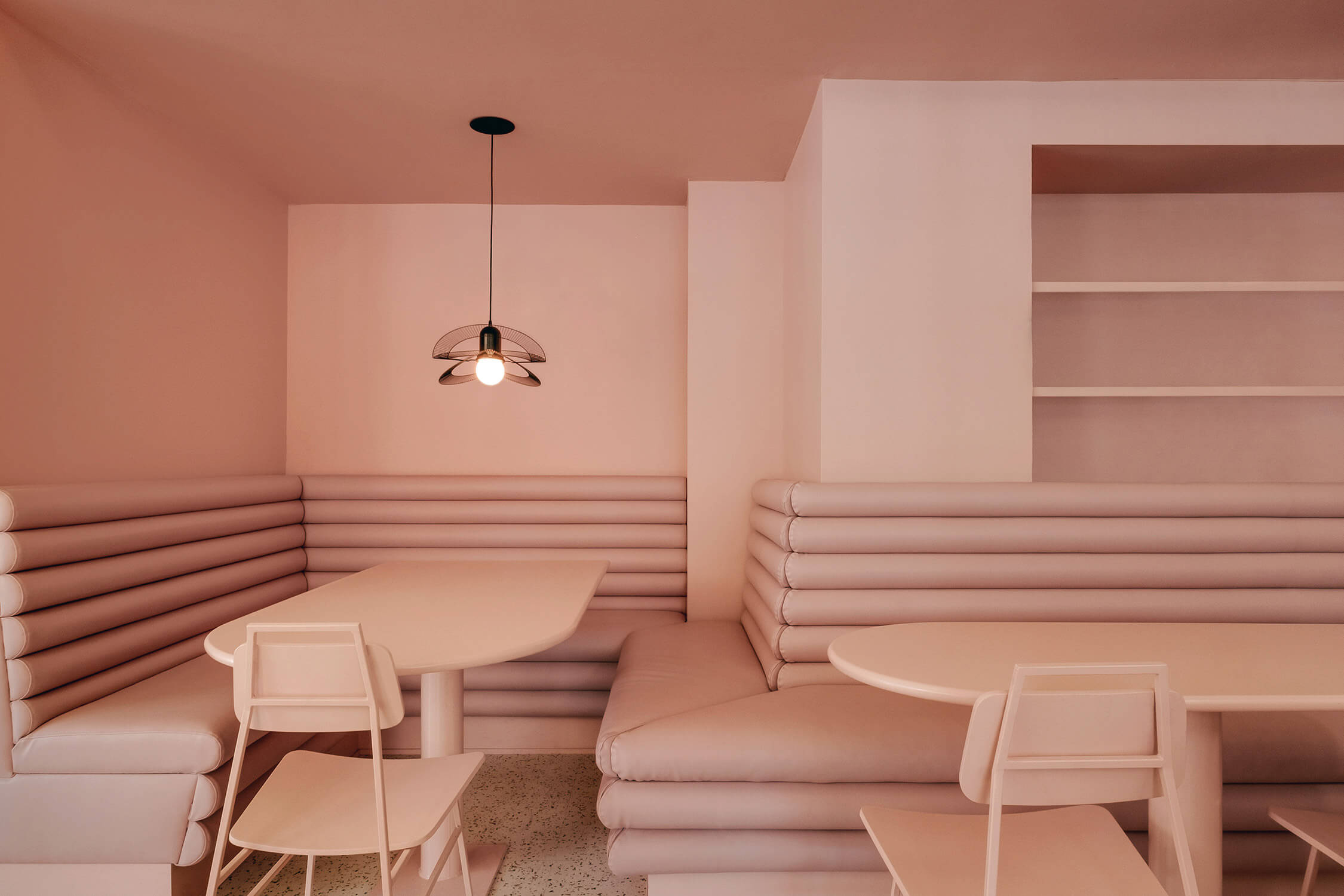
Part café, part boutique, part workshop, Pastel Rita caught our eye thanks to its playful use of colour-coding and attention to architectural detailing. Tasked with creating a cohesive space that served three separate functions, Montreal firm Appareil Architecture chose a trio of complementary jewel tones to demarcate the zones and repeated details – primarily the familiar form of an arch – to tie them back together. When entering the 140-square-metre space, one first encounters the coffee bar, drenched in a lush high-gloss green. A slatted partition (painted the same green) serves as both the cafe’s backdrop and a space divider, with cutouts offering direct views to the gold-toned boutique wall behind, where products from leather goods brand Bouquet are on display in arched niches that mirror those in the partition.
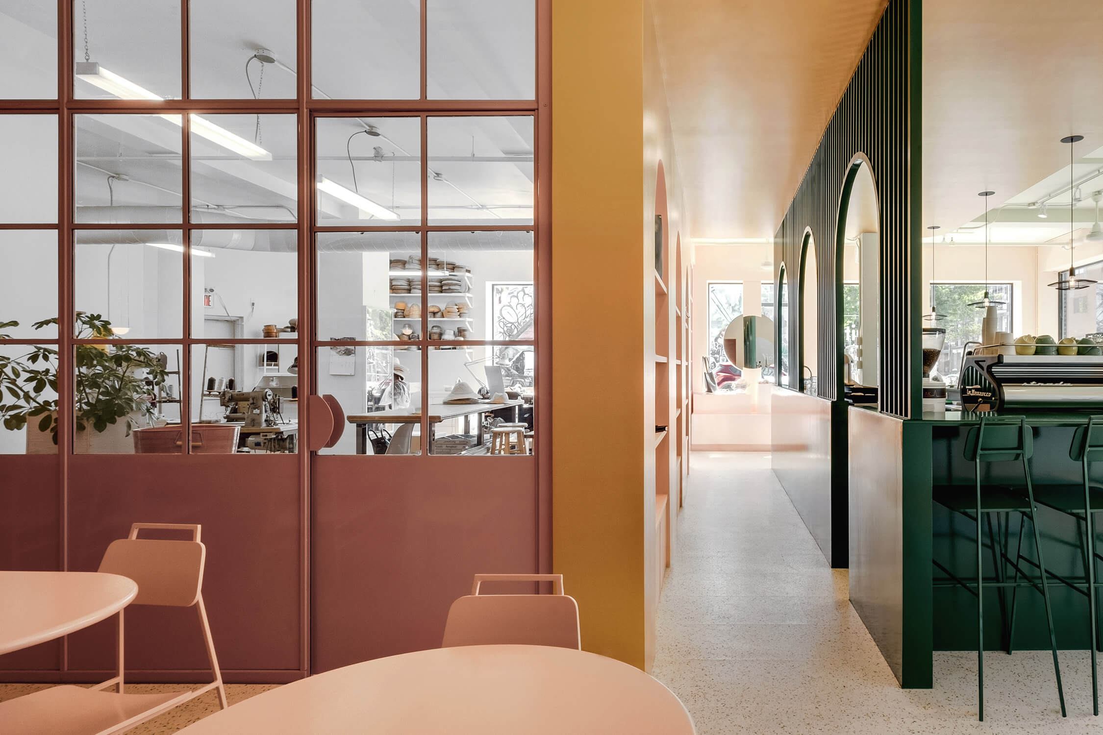
Tucked in one corner is an all-pink corner lounge space with banquettes upholstered in a durable synthetic leather, an inviting spot for socializing. This area also overlooks the studio space, which is wrapped in factory-style windows and is where local milliners and jewellers work alongside craftspeople hand-making Bouquet’s leather handbags and accessories. Lighting throughout was made by local studio Botté, using all recycled parts.
Why we like it: Appareil Architecture’s thoughtful approach sets up a well-paced interior that serves multiple functions without feeling disjointed. There’s something both industrial and elegant about the space, and we’d be more than happy to while away a wintry afternoon there, sipping coffee and watching artisans at work.
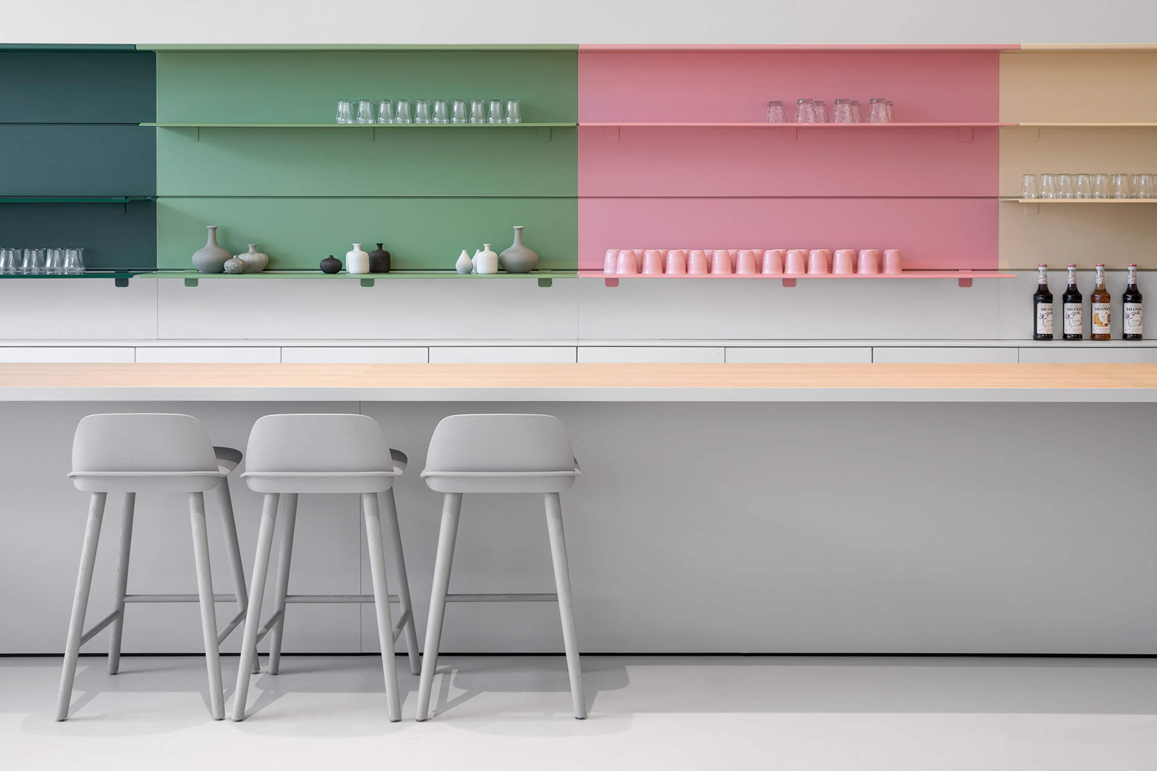
Though the Netherlands’ refreshed Princessehof National Museum of Ceramics actually opened in the final days of 2017, it wasn’t until early 2018 that the world outside Leeuwarden got a look at i29’s re-imagining of the interior. Housed in an 18th-century palace, the museum’s interiors have been gracefully brought into the 21st century and made more accessible and welcoming.
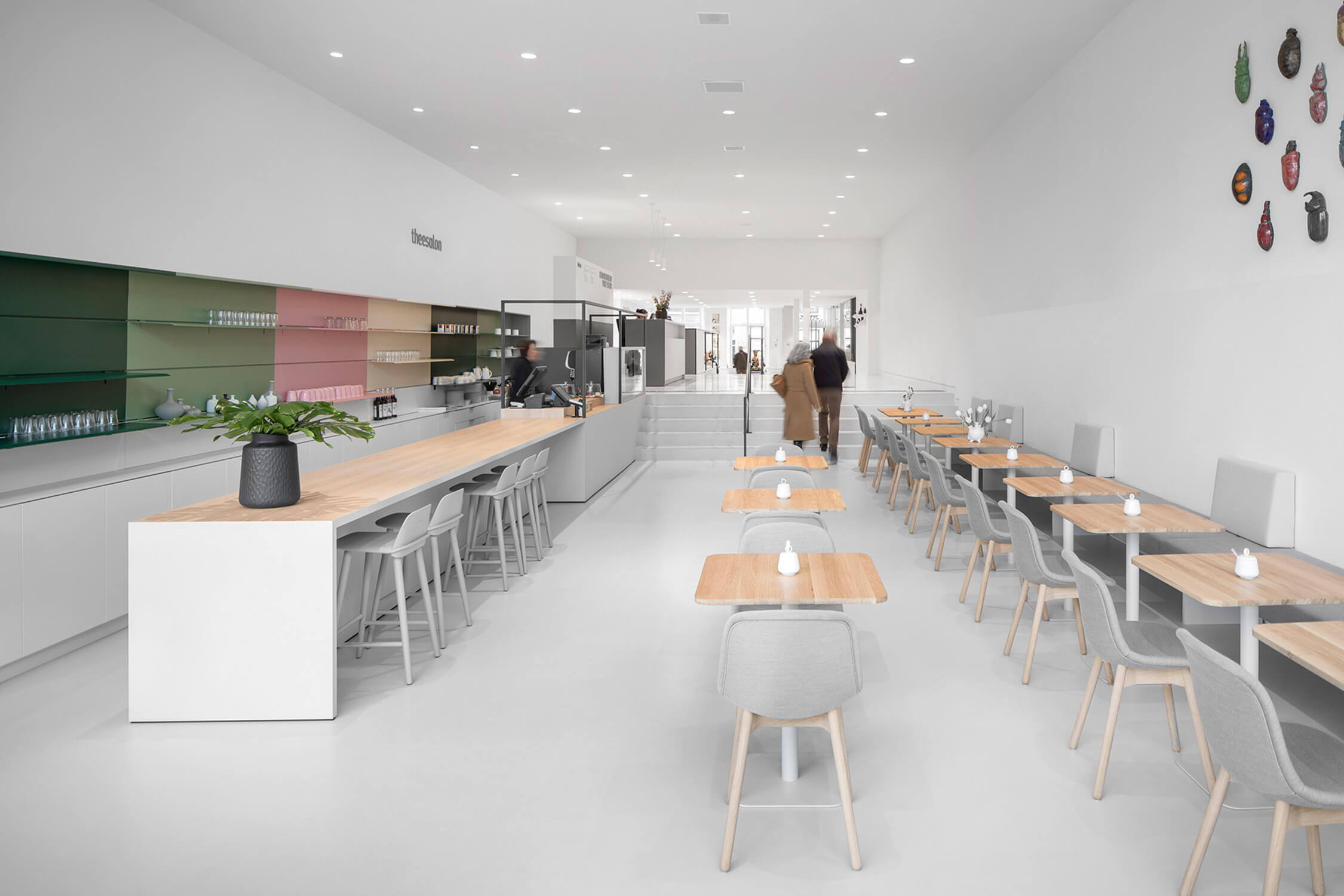
The designers started by reshaping the entrance with a singular circulation spine that joins the front and rear entrances and branches off into the exhibition spaces. Visitors can enter from either end of the building, into a long corridor awash in natural light. Gazing down this extended foyer, the project’s central theme is clear: contrast. The tearoom is characterized by the fresh, spring-like palette of the colour-blocked storage wall, while the gift shop beyond is a muted grey. The grey serves as an ideal backdrop for product to pop against, while the bolder hues of the cafe beyond complements the garden in all seasons.
Why we like it: The firm is known for its mastery of minimalism and we love how it has employed a lively colour palette to add warmth to the space, while maintaining its signature style.
Luca Guadagnino makes films so beautiful you want to live in them. From the Milanese villa in I Am Love to the stately summer home in Call Me by Your Name, his cinematic settings are as indelible as the films’ central characters. When the Italian director followed in the footsteps of Baz Luhrmann, Wes Anderson and David Lynch, branching out into design, his interiors were met with critical praise. With good reason: La Filanda, the weekend home on Lake Como that Guadagnino created for the founder of fashion brand Yoox-Net-a-Porter, is a sumptuous layering of details, both traditional and modern.
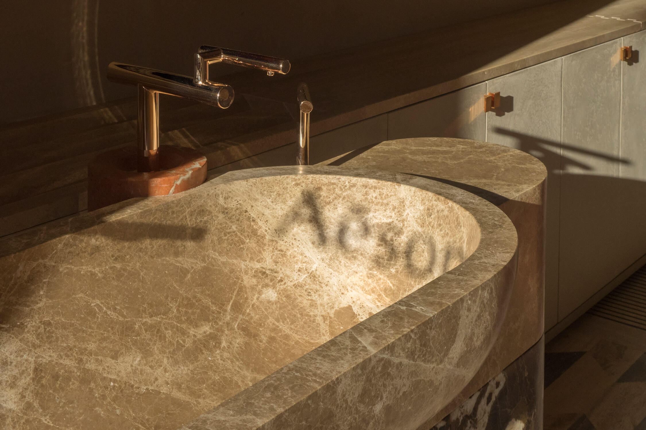
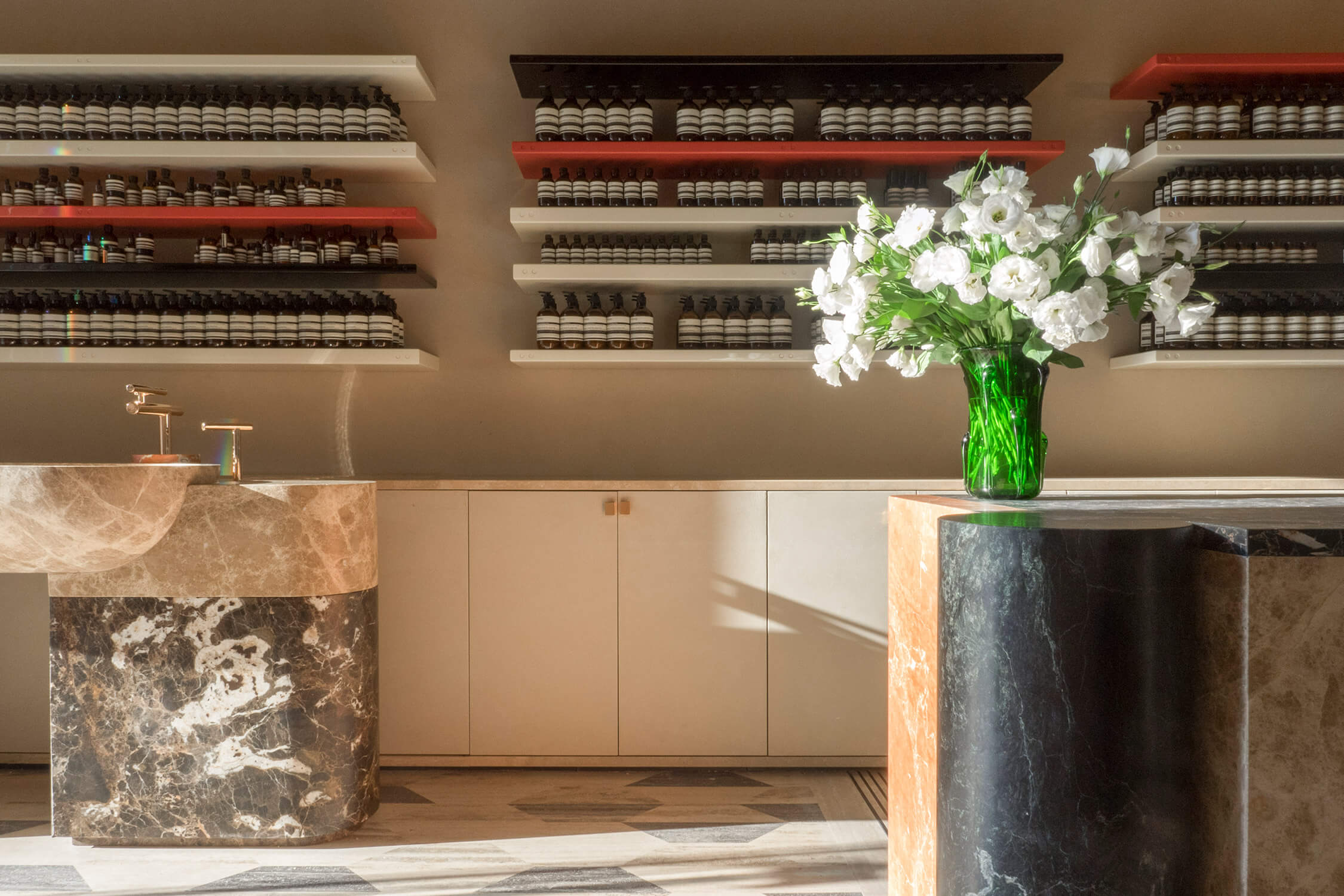
Guadagnino’s recent collaboration with Aesop – on its new shop in Rome’s Piazza di San Lorenzo in Lucina – was pure kismet. Upon his first meeting with the brand, during an unusually heavy snowfall for Rome, Guadagnino was reminded of “the rare [snow]fall that blanketed the city as if a blessing when we shot the opening sequence of I Am Love.” Drawing on the local architecture and history, as well as the cinema of Pier Paolo Pasolini, he developed an austere and elegant language with a palette of classic materials: travertine rhomboid tiles in three tones clad the floor, furniture is carved from massive blocks and inlaid with regional marble, and straw sheaves – reminiscent of the thatched roofs of ancient Rome – cover the ceiling. Lacquered wood was used for the cream-coloured shelving, which features black accents in ode to Pasolini’s black-rimmed eyeglasses. Let’s just say that if you love Italian culture, this is a dream of a space.
Why we like it: We want to live in a world designed by Luca Guadagnino, but for now we’ll content ourselves with shopping in one. Thankfully, the Italian auteur has set up Studio Luca Guadagnino to create more projects in the future.
The concept store has been a thing for some time now, but it remains a tricky program to pull off well. After all, the designer must effectively create a space where any number of divergent activities – shopping, eating, hanging out – are enjoyed simultaneously and seamlessly.
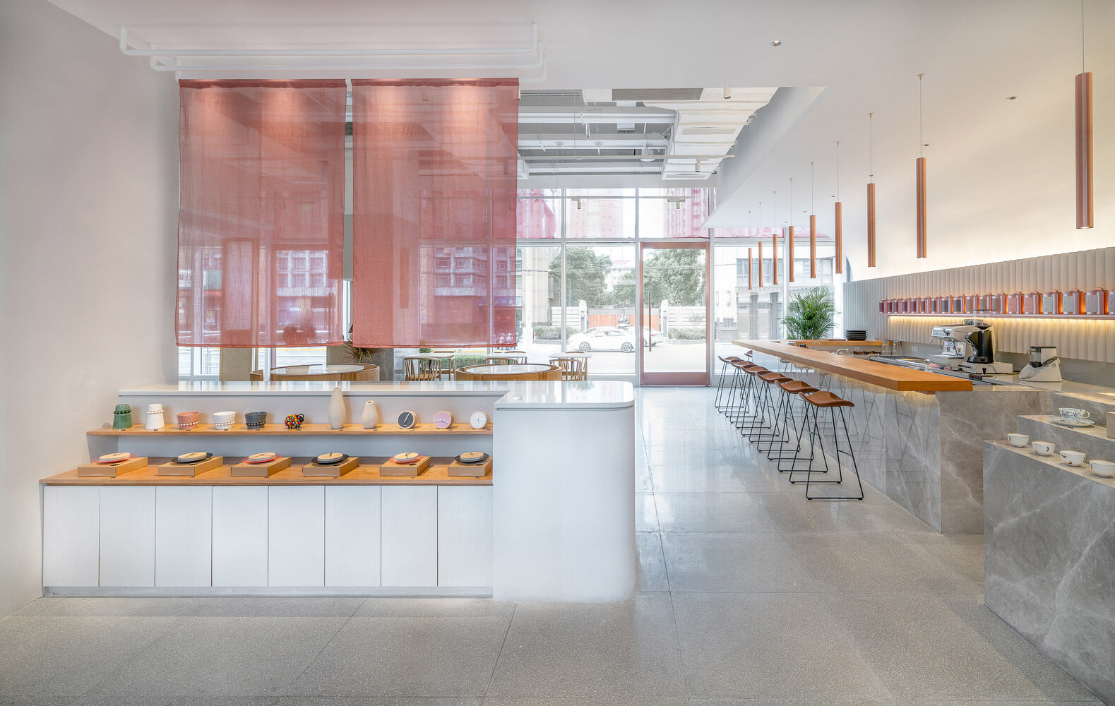
In Shanghai, three-year-old architectural practice Office Coastline was tasked with realizing just such an outlet for Chinese lifestyle brand Genshang – and did so with aplomb. The ultimate design includes an entrance shop that morphs into a tea bar and eatery and culminates in an enclosed lounge.
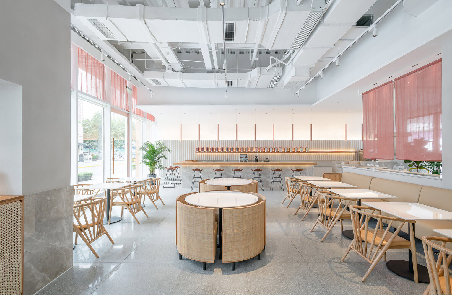
The concept behind the Genshang resto, located on the first floor of a downtown shopping mall, is a “slowing down” of life. At the copper-framed threshold, the doorway is recessed and entered on one side, in order to welcome guests “gently.” Inside, a low display podium and translucent fabric panels that obscure the spaces behind it again direct visitors to the side, where a long wooden tea bar gives way to a restaurant marked by circular table and chair sets that can be pulled apart in order to seat diners or pushed together to serve as display or serving platforms during events.
The final space and innermost sanctum is a lounge room intended for meetings or private dining. “We approached the project by making a gentle sequence,” say the architects. One could add an utterly engaging one, too.
Why we like it: The mix of loveliness and logic, reflected in the delicate yet distinctive colour and materials palette and the well-articulated flow.
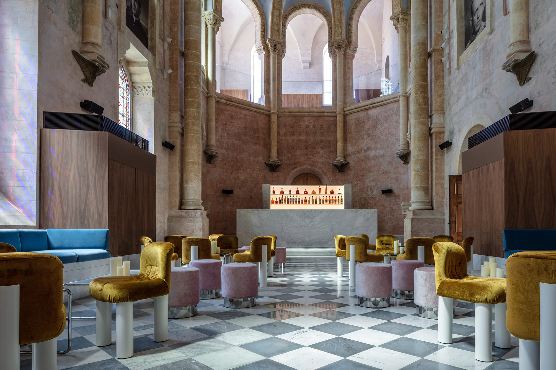
Quintessential minimalist John Pawson may not have been the obvious choice to restore and modernize a former convent school and hospital in the ancient port of Jaffa, now part of Tel Aviv, Israel. But if the decision was counterintuitive, it was also an inspired one: The 120-unit Jaffa Hotel, which Pawson wove from the bones of the two existing structures as well as a new, six-storey wing that also includes 32 private residences, is a design palimpsest without parallel.
Executed in collaboration with local architect and conservationist Ramy Gill, the project clearly benefited from Pawson’s famous restraint, encompassing interiors that both celebrate their period origins and come alive with judicious hits of the new.
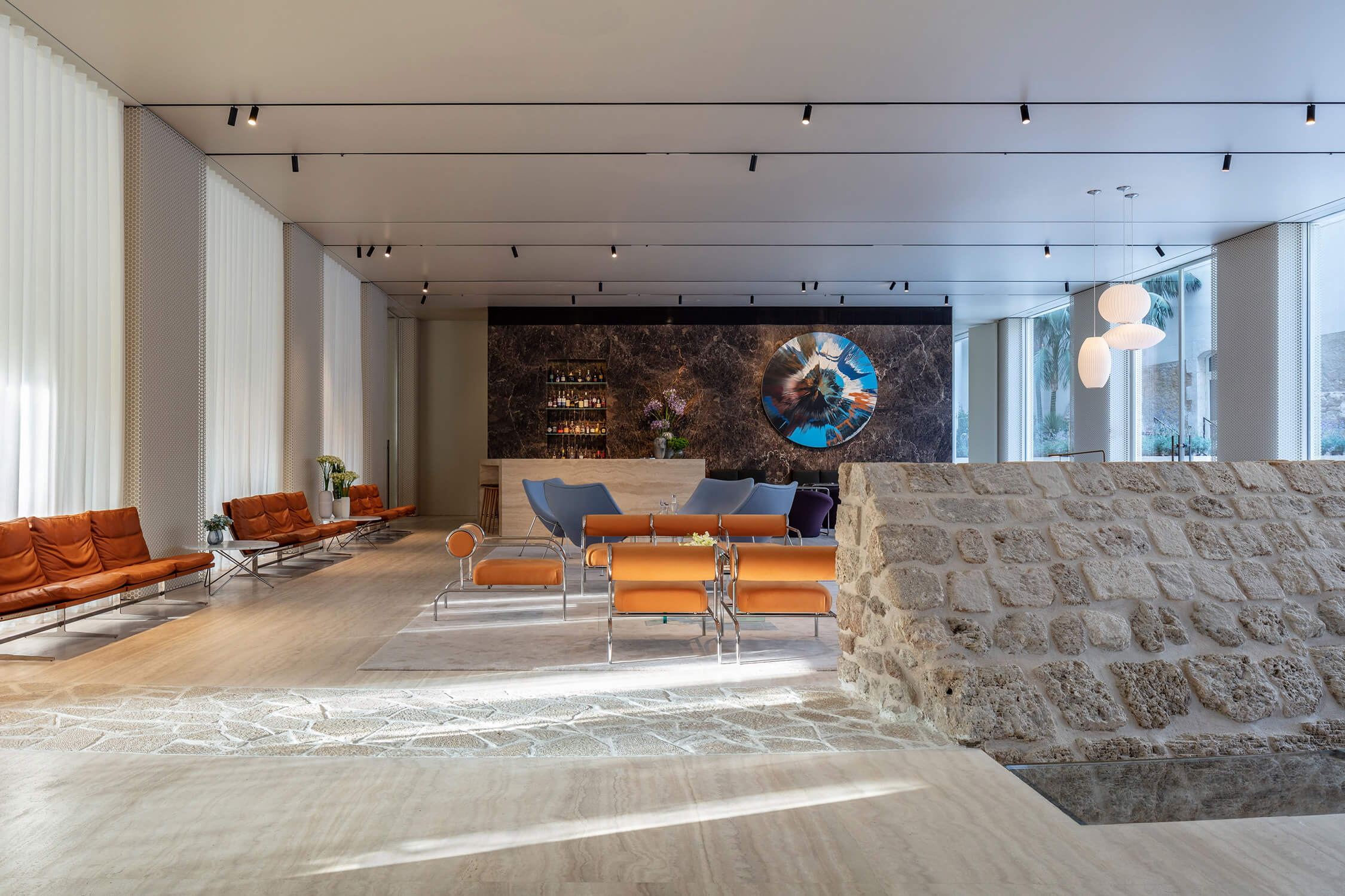
This interplay between history and modernity is perhaps best realized in the hotel’s bar and lounge, where a sumptuous assemblage of gold, blue and soft pink seating sits under the vaulted ceiling and decorative plasterwork of the onetime school’s chapel. Although the hotel’s lobby is in the new wing, it also incorporates the remnants of a 13th-century wall as a focal point of the room, where it shares space with orange Cappellini lounge chairs.
Overall, the result is more resurrection than renovation, Pawson having given new life to old rooms with typical (understated) boldness.
Why we like it: Many design updates skillfully retain historic exteriors but obliterate interiors. The Jaffa Hotel’s are a rare exception, adopting an ultra-contemporary visual language without stifling heritage or context.
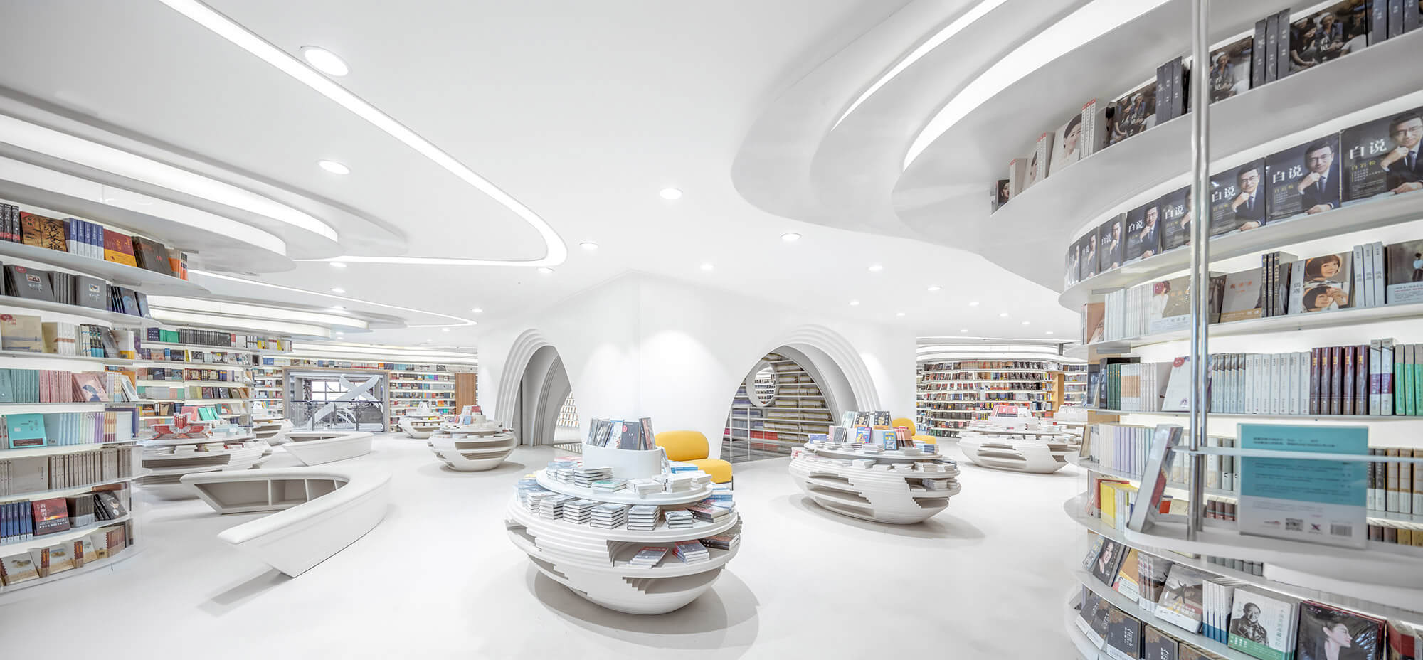
As books are increasingly pushed aside in favour of other media, what the bookstores of the future will look like becomes an increasingly important question in design, much as we are reimagining the libraries of tomorrow. This project, by Shanghai’s Wutopia Lab hints at a return to traditional reading with its futuristic Zhongshu Bookstore in Xi’an. Though the interior architecture is an animated confluence of curves, a stark monochromatic palette allows the books to take centre stage.
Digital programming and CNC machine tools enabled the architects to craft such a soft space from over 300 tons of steel. Every metal plate was optimized through software and cut offsite, then assembled using a numbered system. An undulating sea of white, the only source of colour in the entire project comes from the books on the over 3,000-metres of free-standing steel shelves, which swoop through the space like ribbon. Overhead, over 30,000 metres of LED strips follow the curves of the shelves to light the space.
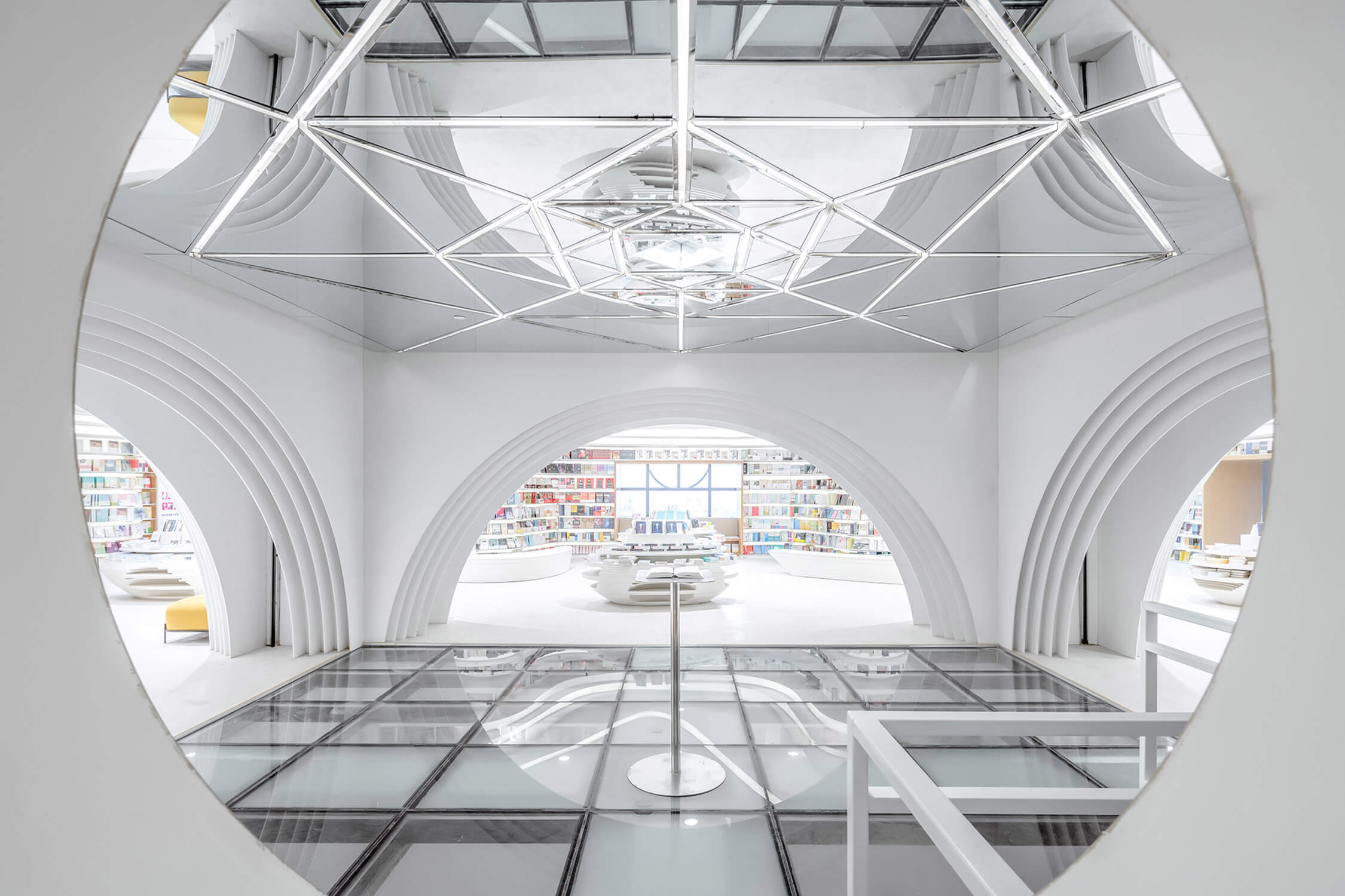
At the core of the store’s public reading area, Wutopia inserted what they call the “pantheon.” The floor slab has replaced with glass, meant to evoke a body of water. At the centre of the glass is a pedestal where customers will find Zhongshu’s Book of the Month. Below, a small room can be used for reading or reserved for meetings.
Why we like it: Wutopia Lab haas created a space packed with eye-popping design features, without distracting from the merchandise on display.
The editors of Azure have compiled their favourite interior design projects of the year and narrowed it down to a list of 10 spaces in Rome, Montreal, Tel Aviv and the Netherlands, among other locales. Here are our picks for the best interiors of the year.