
To say Montreal architect Jean Verville has a flair for theatrics would be an understatement. But his masterfully minimal approach results in designs decidedly more sophisticated than over-the-top or gimmicky. With IN 3, an apartment in his home city for a music composer, Verville orchestrated a mix of materials both luxe and industrial, resulting in a superbly pared back space that conceals its domesticity behind flat-fronted volumes.
Exposed concrete beams on the walls and ceilings establish an austere palette, which Verville contrasted with the insertion of floor-to-ceiling brass panels that run throughout the entire space. The panelling also serves to hide the everyday trappings of home life behind its sleek surfaces, further adding to the precise aesthetic. In the kitchen, all-white cabinetry and counters add the apartment’s third and final colourway, which is repeated in the white-marble-covered bathroom. As unexpected as the material mix, it is also surprising to see Verville himself in the photoshoot sweeping through the apartment cloaked in black. His presence adds yet another layer of dramatic staging.
Why we like it: Verville’s whimsical signature is on full display here, transforming what could have been a somber concrete-clad apartment into something playful and intriguing.

Best Adaptive Reuse: The Department Store by Squire and Partners
This fall, British firm Squire and Partners moved its Brixton headquarters to a former department store that had been left to decay since 2012. Rather than gut the crumbling Edwardian building that dates back to the 1900s, the firm decided to peel back the layers to reveal a stunning backdrop of old world charm. Now, some 250 employees sit at modern-day desking systems and convene around expansive boardroom tables that beautifully contrast with original wood flooring, elaborate ironwork railings and exposed brick walls covered in graffiti.

With over 6,000 square meters to play with, the office spreads itself across four floors and features a multitude of provisions, including breakout areas, meeting rooms, exhibition spaces, a model-making workshop, a cafe, a bar, a roof terrace and a record shop.
Why we like it: The Department Store epitomizes the very best of sustainable design’s 3 R mantra: reuse, reduce and recycle.

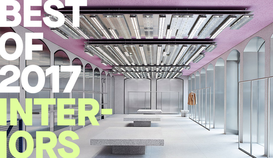
Best Brand Interpretation: Acne Milan by Acne
Any fashion brand opening a boutique in Milan, world capital of style, has to bring its A game. Acne Studios, the Swedish purveyor of luxury clothing and accessories, did just that when it created its new flagship in the upmarket Brera neighbourhood. Occupying the ground floor and basement of an 18th-century building on the Piazza del Carmine, the interior is a cross between rustic and futuristic, juxtaposing slabs of soft pink Lombardy granite, used on the floors and tables, with space age lighting and display fixtures. In the main showroom, walls are lined with arched stainless steel panels that echo the arches of the building’s exterior facade; the highlight is the custom-built lighting installation that hangs from the pink stuccoed ceiling.
Why we like it: In a retail environment rife with stylish options, Acne’s Milan flagship stands out for injecting the brand’s trademark minimalism with colour and complexity.

The Herman Miller “shop in shop” in Singapore furniture retailer XTRA’s new flagship store is trompe l’oeil design on a grand (and very clever) scale. From a distance, the 20-metre arched structure that envelopes the space looks like tufted fabric, but it’s actually a plywood skin that designer Pan Yicheng of Produce Workshop calls fabricwood. To create fabricwood, Yicheng cuts slits into a sheet of plywood to make it bendable, then layers two of the sheets together with wooden dowels and rivets. The ultimate structure at XTRA – a billowing marvel that looks upholstered – was mapped out through a combination of physical and computer modelling.
Why we like it: Inspired by the furniture showcased underneath it, the Herman Miller canopy is that rare and perfect fusion of conceptual idea, technical innovation and aesthetic result.

Best Community Centre: Underground Forest by Wutopia Lab
The crowning touch for a community club in Onepark Gubei, a swish new Shanghai neighbourhood, the Underground Forest was envisioned as a place where neighbours could get to know one another. Aiming to create a warm, welcoming environment that would draw residents in, local architects Wutopia Lab shaped the space to evoke a serene forest where white oak bookshelves curve overhead to form a canopy dotted with white cloud-like pendant lights.


Best Temporary Intervention: Opening Ceremony by Patrik Ervell
Menswear designer Patrik Ervell is known for exploiting unusual fabrics to craft his utilitarian yet elegant clothing. For a fall/winter 2017 pop-up within the concrete storefront of Opening Ceremony in New York, he took a similar stance by elevating basic cotton-candy pink fibreglass insulation into an installation that treads the line between modern art and raw industrialism. Working with designer Joseph Whang, Ervell arranged an irregular grid of untreated wood frames to contain the building material, an intentional nod to his appreciation for Mondrian and other modern artists. The choice of material is also deliberate as it was the inspiration for Ervell’s sure-to-be-iconic pink puffer jacket from this season’s collection.
Why we like it: The feathery false wall exemplifies the designer’s talent for using common materials in unexpectedly beautiful ways.

Best Hideout: Secret Studio by Fernando Abellanas
Inspired by the makeshift forts of childhood as well as urban vagabonds, Spain’s Fernando Abellanas spent two weeks this past May forming a habitable space in the underside of a Valencia overpass, five metres above ground. He devised a wheeled metal bracket system and hand crank to roll a plywood box up under the concrete arch that forms the room’s ceiling and walls.

The trained plumber/self-taught designer, who heads up the industrial design studio Lebrel, added a wall-mounted chair and desk to create a tiny office, as well as shelves that hold a bedroll and lamp, for overnight campouts. Creating a treehouse for the urban jungle, Abellanas called it his “refuge from the city, made from the city itself.”
Why we like it: Do we really need to explain this one?

Best Department Store: Printemps Haussmann by Uufie
If you’ve ever shopped in Paris, chances are you’ve encountered Printemps’ flagship store on Boulevard Haussmann. Built in 1865, the department store is an Art Nouveau wonder that sits within a stained glass dome – an old world delight from both the interior and exterior. Accordingly, when Toronto studio Uufie was selected to revitalize Printemps’ Haussman location, it would build a dome of its own. And it’s no less stunning than its predecessors.

Called The Veil, Uufie installed a 24-ton, 12.5-metre-wide, 25.5-metre-high structure that soars up to Printemps’ ninth floor. Constructed using laminated, white-painted aluminum sheets arranged in repeating floral patterns, Uufie’s dome is outfitted with 17,200 petal-shaped openings. Each is filled with multi-coloured dichroic glass, and as visitors ride escalators further up into the building, they’re able to peer behind the glossy veil, revealing boutiques hidden in plain sight. It’s simultaneously playful, mysterious and abstract.
Why we like it: With the addition of a single feature, Uufie elevated an already pleasurable shopping experience to even greater heights.

Best Co-working Space: WeWork Shanghai by WeWork with Linehouse
Since its inception in 2010, co-working juggernaut WeWork has launched a series of swoon-worthy interiors. Its newest Shanghai location, which opened in July, may be its best yet. Located in an old opium factory – which had been converted to artists’ studios – WeWork’s in-house design team worked with local studio Linehouse to craft a 5,500-square-metre space that accomodates 1,500 people. Everywhere, the site’s history is referenced.

Take the stunning atrium, which sits at the centre of the horseshoe-shaped building. Enclosed within an original brick facade, the soaring space is filled with luxe upgrades: pastel terrazzo lines the floors and walls in carpet-like patterns; a custom lighting installation drapes glowing orbs from pink and grey wiring; wooden tables and hardshell chairs are everywhere; the reception and coffee areas are curio cabinets sculpted from wood and brass. Head up the ivy-green staircase and more workspaces reveal themselves to offer majestic views of – what else? – that gorgeous atrium. Some rooms feature wallpaper bearing golden poppies, a not-so-subtle reminder of the building’s origins.
Why we like it: Just like the concept of the shared workplace itself, the design is an on-trend twist on the traditional.

Best Multi-purpose Space: Leisure Center by Casper Mueller Kneer Archiects
The future of bricks-and-mortar retail may lie in stores that don’t look anything like stores, but seem more like sensorial environments that ooze personal aesthetic. That, at least, is the philosophy behind Leisure Center, a novel fashion and culture emporium in Vancouver designed by Casper Mueller Kneer Architects of London.

Housed in a heritage building on Homer Street, the 22,000-square-metre space has been left mostly in a raw state, especially the concrete floor that’s richly pock-marked from a near century’s worth of wear and tear. To showcase the fashion, art and lifestyle inventory selected by owners Mason Wu and MuYun Lu - including clothing by Commes des Garçon and home accessories by Tom Dixon – the London firm inserted freestanding aluminum walls that rotate at 45 degrees to the existing building grid. The moveable walls delineate various zones including a bookshop, a tonic bar and a private shopping area. It’s not too surprising to learn that since opening in October, many shoppers spend time in the space as though it’s a gallery, simply soaking up the ambience.
Why we like it: We love the way the original Art Deco building is still present, and captured as ghost-like reflections by the brushed aluminum walls.