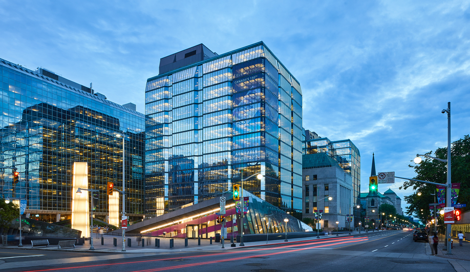
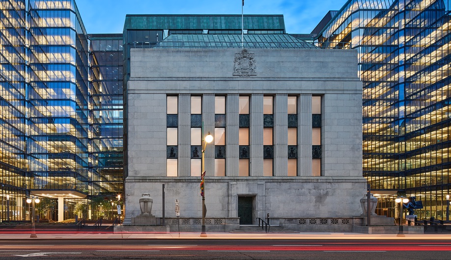
Upgrading Ottawa’s Bank of Canada, at the bustling corner of Bank and Wellington streets, is no easy task. The 7.7-hectare site already features two architectural layers: Marani, Lawson and Morris’s neoclassical bank, built on-site in 1938; and a glassy expansion, installed four decades later and designed by Canadian icon Arthur Erickson. Yet even with the modernizing 1970s addition, the headquarters hadn’t been able to accommodate the 21st-century workplace, let alone make way for computers.
To make the necessary upgrades, the bank brought in lead architect Andrew Frontini of Perkins + Will to oversee a top-to-bottom renewal that included adding seismic protection – something that wasn’t considered in the 1970s. The original glass box was also showing its age, due to 60-degree temperature swings that resulted in rising costs in energy and maintenance. Its public atrium also posed potential security risks.
“The challenge was to create a cohesive design strategy that unified the project’s many facets – all within the context of a building originally designed by one of Canada’s most celebrated architects,” says Frontini. “And, because it’s the Bank of Canada, it had to be on-time and on-budget.” With five years to plan and execute, the team performed a heritage analysis, determined which architectural elements were essential and got working. Here are the five dramatic upgrades Perkins+Will made to the Bank of Canada that are, in some instances, invisible to the eye.
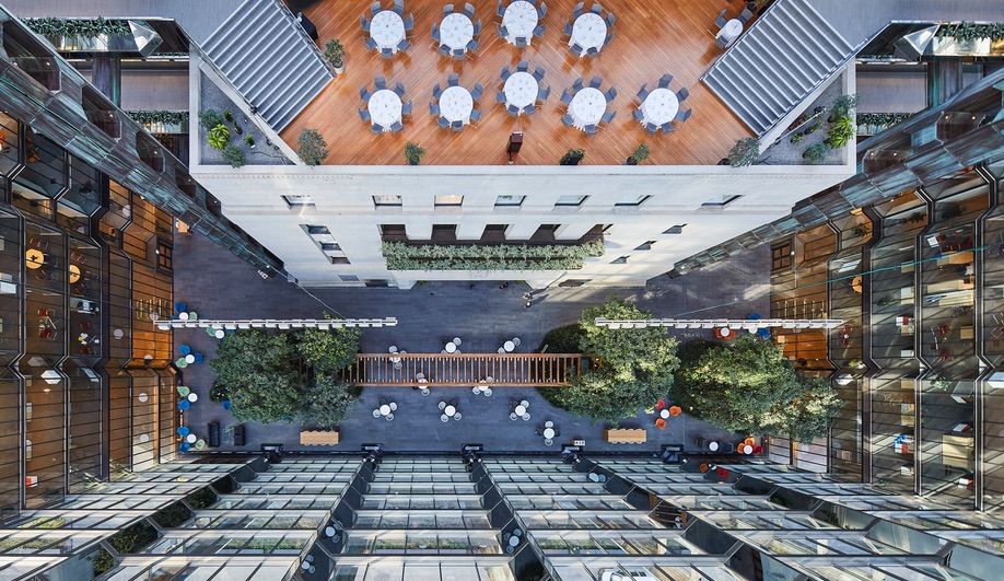
The original atrium, says Frontini, was intended to be an “abstraction of the Canadian landscape.” Surrounded by 12 storeys of glass, Erickson envisioned it as two mounds (meant to signify the nation’s mountain ranges) connected by a trellis with prominent water features and native flora. In reality, the well-lit room was underused: its topography, which was 60 per cent water and vegetation, prevented people from gathering an, in the end, it was primarily used as a thoroughfare.
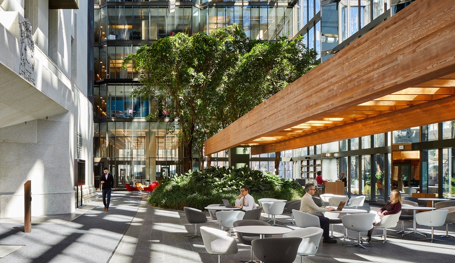
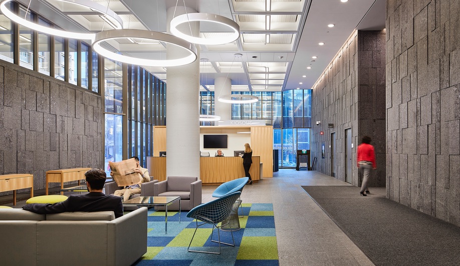
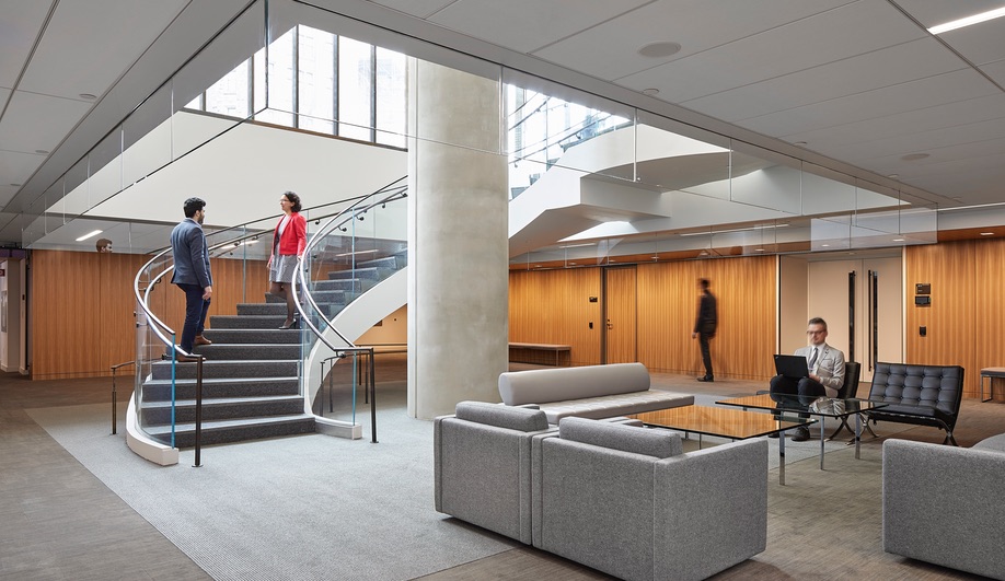
To amend those limitations, Perkins+Will flattened out the atrium and removed the water features, which occasionally leaked (and “smelled like a chlorinated swamp at times”). The new atrium is described as a “collaborative landscape.” Working with Toronto firm DTAH, it now has a café, collaboration-friendly furniture, planted mounds for shade and a knowledge centre filled with bank-specific resources. Erickson’s bridges and rooftop terraces remain. “It’s an architectural way to break down departmental silos,” says Frontini. “It’s exciting to see it populated dynamically. Every inch is being used now.”
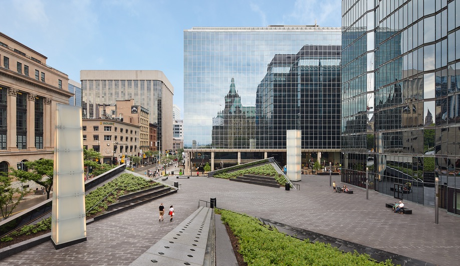
Perkins+Will could afford to be more playful with the building’s plaza, which was formerly windswept and bereft of pedestrian amenities. The firm developed a concept where the corners of the site curl upward into three tiered landforms while the Bank of Canada’s currency museum is located beneath the plaza. The landforms incorporate bleacher-style seating and add a new type of inviting public space to the foot of Parliament Hill.
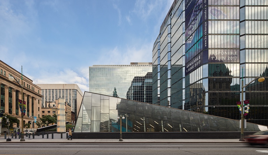
The entrance into the museum is via a pyramid-like glass pavilion developed to reflect Erickson’s bronze, glass and granite material palette. Three illuminated columns were added to serving as beacons to further draw people in.
While it has not yet lived through an Ottawa winter, Frontini says the plaza and its garden-planted tiers are designed with events like the Winterlude festival in mind. “We did a lot of sun and wind analysis,” he says. “We positioned the landforms to help create a microclimate, where the wind is buffered. We were interested in extending the seasons by using these microclimates, so you can start using the plaza earlier in the spring and later in the fall.”
The Bank’s mirrored facade may be its most identifiable feature, and Frontini wanted to keep that structural expression intact. So, to combat the building’s low-performing envelope, a silicon-jointed glass wall was nested behind the original mirrored skin. This created a foot-wide “dynamic buffer zone,” which helps trap and disperse heat. And it’s largely invisible.
“It’s like an inner layer,” says Frontini. “As the sun moves around the building and heats up the air, it usually heats up the people sitting by the window. But now, the hot air is returned to the ventilation system, where it moves to parts of the building that are cold. As a result, the firm was able to make the duct sizes much smaller while still providing the comfort and ventilation that’s needed.”
Steel cross bracing is typically used for seismic stabilization, but for Frontini, that idea wouldn’t work – he didn’t want to add to the Bank’s structure. Instead, PCL Construction performed a structural intervention by demolishing the building’s elevator cores and rebuilding them with seismic stiffening added.
“It was a surgical demolition and reconstruction,” says Frontini. “PCL staged this incredible set of movements, where they shored up each floor with temporary structures, demolished the cores and kept on moving upwards. In the end, all of that reinforcement is invisible, and the office towers are as close as possible to their original state.”
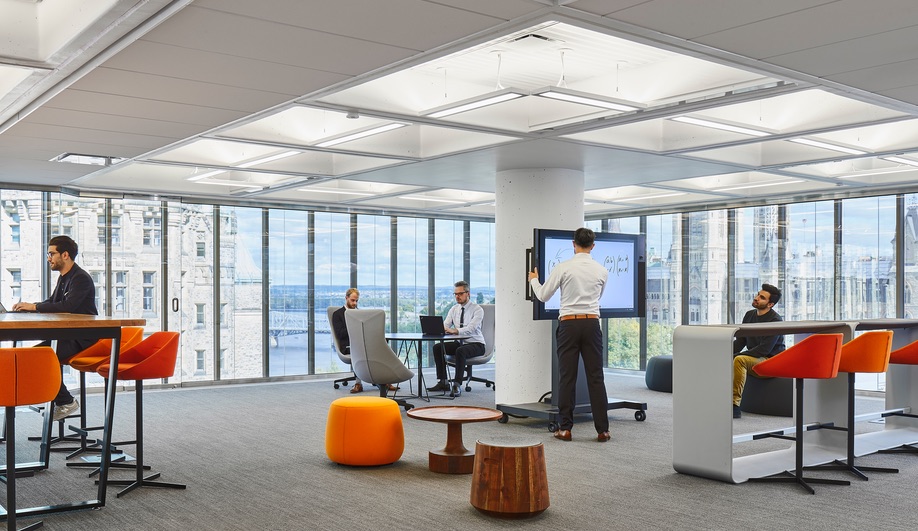
In the office towers, each floor has one of Erickson’s signature design motifs: a tree column, which rises from the floor and spreads out into a waffle slab. While undeniably handsome, these columns, which integrated lighting and limited amounts of ventilation and heating functions, were inflexible. They made it impossible to drop the ceiling to add more services.
Instead, Frontini and his team created a near-invisible overlay of white ceiling panels, which house modern amenities. They conceal thin, flat radiators, sprinklers and an LCD lighting system. The panels also act as an acoustic damper – and also allowed Perkins+Will to retain Erickson’s open-concept workspaces. “If you look at the photographs, the panels are there,” he said. “But you don’t really see them.”
SaveSave
SaveSave
SaveSave
SaveSave