
An exploration of how architecture trends and more can be visualized in various ways, Archi-Graphic beautifully expresses complex ideas.
Thinking how to best describe this playful book, subtitled An Infographic Look at Architecture, I realized one approach could be a Venn diagram (an infographic about infographics – how meta!). It might work like this: one circle labelled “architecture,” the other “infographics,” and the overlap between them would be this book.
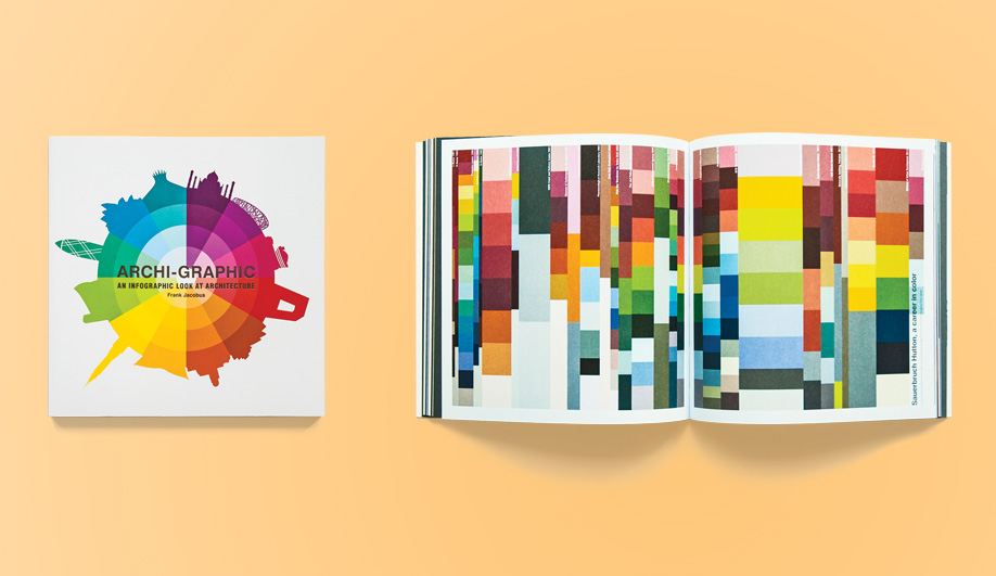
Archi-Graphic (Laurence King Publishing) is an exploration of various ways architects, architecture trends and locations can be organized, timelined, pie charted, word clouded and flow charted. The idiom can be a powerful tool to visualize complex data and make it digestible, and to offer new perspectives that reveal surprising insights or patterns that would otherwise be easily overlooked. And it can express, in a straight-forward way, complex ideas that are difficult to communicate using only words – for instance, the tangled web of Rem Koolhaas’s relationships with other architects.
This is certainly true of author Frank Jacobus’s contributions. Some of his mappings are lighthearted (such as the one cataloguing the defining facial characteristics of famous architects), while others are more serious (the entry that chronicles the slow increase in female architects over time). Assembled, they give a varied picture of where architecture is coming from, and perhaps where it is heading.
The book is full of eye candy, with lots of bright colours, concentric circles, and compositions that look like paintings by Mondrian. And, in true infographic form, the overall design is clean and simple – lots of visuals, not a lot of text.
Architecture and infographics are similar in that they are both containers that develop some kind of meaning only when their contents are added. It would be interesting to follow up with a series of data-inspired buildings: Infographics as Architecture. Imagine waking up inside that Venn diagram.
Henry Tyminski is creative director and co-founder of Sali Tabacchi, a branding and design studio based in Toronto.