
The first iPhone, held famously by Steve Jobs at a gasp-inducing ceremony in the fall of 2007, looked very different from the smartphone of today. It was a palm-sized plastic and aluminum brick, crowned with a tactile home button and iPhone OS 1, then considered an extension of Apple’s desktop operating system. But its marketing slogan – “this is only the beginning” – proved predictive: over the next 11 years, the smart phone would become the perfect merger of industrial and interaction design, with Apple’s iOS and Google’s Android becoming the de-facto centres of digital life.

Tech brands often hail the triumphs of their hardware – along with three new notch-ified iPhones, Apple’s latest keynote hailed its latest advancement in silicon, the A12 Bionic chip – and, in form, the industrial design has always been on point. In function, though, the phones’ interaction design has been driving a major problem: the need for tech/life balance.

The problem, here, is that UX designers have done their job too effectively. High digital engagement is generally looked upon as a positive metric, but it’s resulted in phones that are too addictive: according to a Deloitte study in the U.S., we check our phones 47 times a day. Nearly nine out of 10 phone owners check their device within an hour of waking up. ComScore says this has resulted in nearly three hours spent on a phone daily, a number that adds up to 86 hours monthly.
That’s a lot. Another statistic shows that many of us are aware of our digital habits: 45 per cent of people have actively tried to limit their cell phone usage.

Tech companies understand that, too. Behind the glitz of the latest iPhone launch, Tim Cook and co. also rolled out iOS 12, an operating system mainly focused on restoring fluidity and functionality to old devices. But it also released a feature named Screen Time, which aims to illustrate – and, in cases, limit – the amount of time spent on the phone. Accessible via a phone’s settings or through a widget, it generates an activity report illustrating how you use your device: mine, at midday, displays that I’ve logged 1:21 on my phone, 23 minutes above my average. According to my report, I pick up my phone 122 times per day, and my time is roughly split between reading and social networking.

From there, Screen Time allows users to schedule down time – which limits phone time during specified periods – set granular app limits or select a group of white-listed apps. “In iOS 12,” Craig Federighi, Apple’s senior vice president of software engineering, said in a statement, “we’re offering our users detailed information and tools to help them better understand and control the time they spend with apps and websites, how often they pick up their iPhone or iPad during the day and how they receive notifications.”

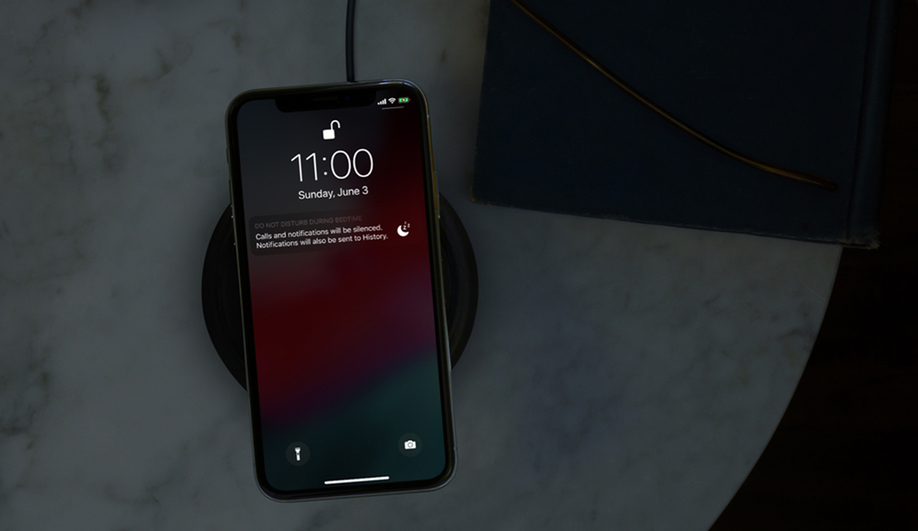
Apple has also refined the design of its Do Not Disturb function, turning off distracting notifications and dimming the screen whenever it’s on – including at night (an important feature, considering ComScore’s reporting found that nearly half of us check notifications in the middle of the night). These tweaks, like much of iOS 12, are subtle design solutions quietly aimed at shaping better tech habits.

Though Apple often drives tech adoption, it’s not always on the bleeding edge. Google took a stab at solving our tech addictions last spring with the launch of its Digital Wellbeing program, set to premiere with the upcoming version of Android, launching in October with the next generation of Google’s flagship Pixel phones. Android controls roughly 77 per cent of the global smart phone share, meaning Google’s Digital Wellbeing program could have significant reach.

Google’s approach to digital well-being, stemming from the tech company’s Material Design UX guidelines, is arguably more aggressive than Apple’s: like the iPhone, its dashboard provides frighteningly granular data, including how many times you’ve unlocked your phone and how many notifications you’ve received. Once screen-time quotas are hit, Android will offer users prioritized notifications, pop-up reminders to take a break and grey-scale options (which some argue is a powerful tool in breaking tech addictions). Its YouTube app has similar features, along with the ability to turn autoplaying videos off. Changes to Gmail and Photos, two other popular Google apps, are coming next.
While these efforts at structuring digital habits are admirable, their effectiveness remains to be seen – and, lest we forget, they’re designed by manufacturers that sell digital experiences. (My own user habits are telling: I’ve been shocked at how much time I spend on my phone, but not quite motivated enough to set limits.) But Apple and Google’s steps towards digital wellbeing prove that they understand that there is a problem, one that they helped create, namely that digital addiction is a design dilemma that requires design thinking.