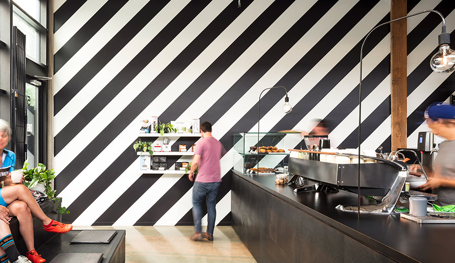
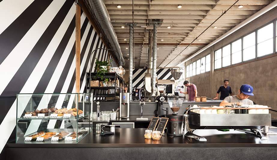
Timbertrain Coffee Depot by Public Architecture + Communication, Vancouver
With exposed ceiling joists and ductwork, original concrete floors and an unfinished cinderblock wall, Timbertrain Coffee Depot in East Van has a decidedly roughed-in look, albeit one with a polished refinement.
To transform its industrial shell – an end unit in a building whose past lives have included artist studios and an auto-body repair shop – into a welcoming multipurpose space, the roaster and café called on Public.The Vancouver design and communication studio executed a plan that required little intervention to make a big impact.
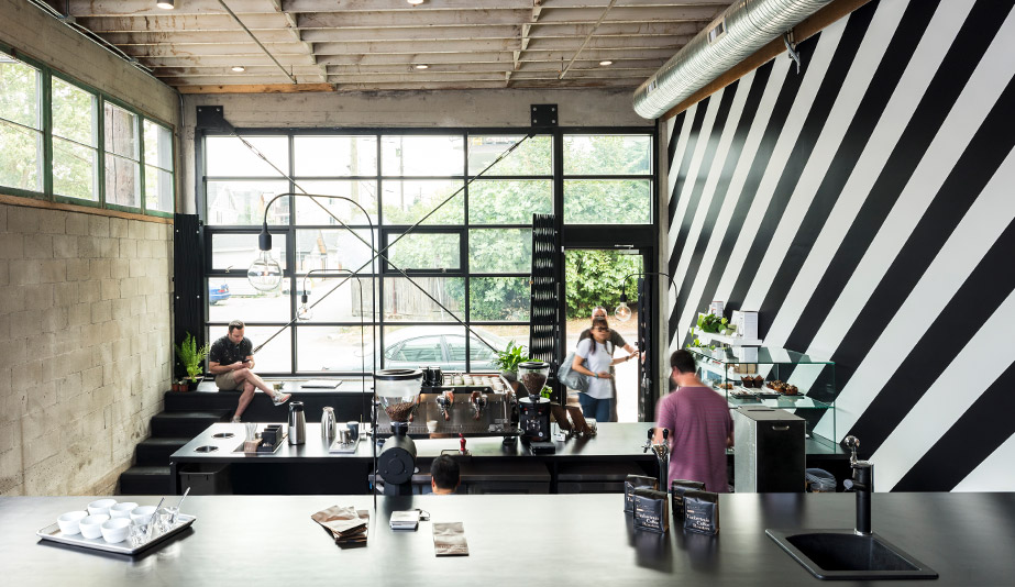
Stealing the scene is a high-contrast wall of alternating black and white forward slashes that reflect, according to the firm, “the ambition of the owner, the energy of the times and the vibration effects of caffeine.” A collaboration between Public and graphic design firm Post Projects, the painted pattern stretches the length of the nearly 23-metre-long south wall, emphasizing the 4.4-metre ceiling height and setting an overall energetic tone.
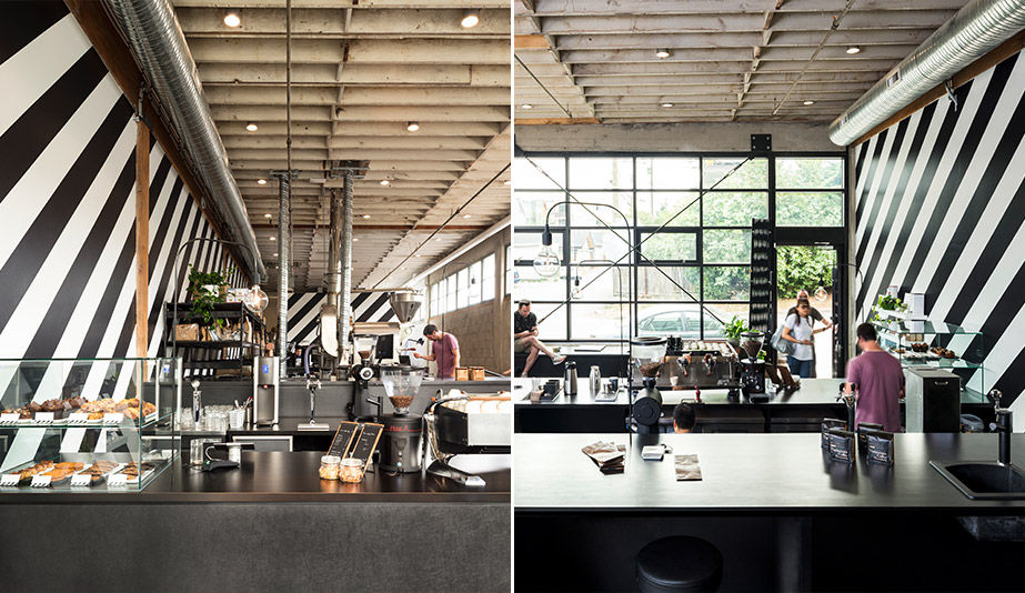
The east to west orientation of the slashes also directs the environment’s activity: In the morning, the front-of-house serves up coffee and baked goods. This service shuts down midday when the daily roasting takes place in the middle zone. And come evening, the back area can host craft-coffee brewing seminars and other related events.
Eames NW by Best Practice Architecture, Seattle
Seattle menswear boutique Eames NW prioritizes elevated basics made from quality materials in well-curated colour ways. It’s not surprising that this aesthetic philosophy played heavily in the design of its first brick and mortar location.
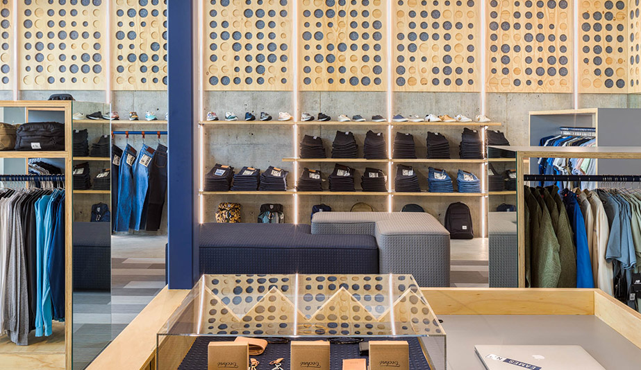
Spearheaded by local studio Best Practice Architecture, the 100-square-metre shop located at the border of the city’s Wallingford and Fremont neighbourhoods features a palette of raw materials – plywood, powder-coated metal and recycled denim – chosen to highlight the high-end clothing while maintaining an approachable attitude.
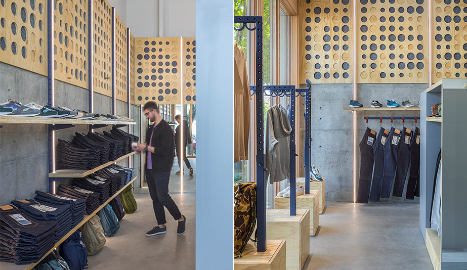
Without a doubt, what first catches the eye is an installation of 13 plywood panels running along the upper portion of two walls. It is animated by randomly sized and spaced circles – not unlike those found on the soles of athletic shoes, notes project principal Kailin Gregga – that alternate between being milled or backed with denim. It creates a bold frame for the retail portion of the space. Grey denim-toned carpet planks further delineate the area and polka-dot upholstered pouffes offer a comfortable spot to try on sneakers, a main product focus for Eames NW.
Elsewhere, polished raw concrete, sleek LED strip lighting and a custom-built plywood mezzanine that does triple duty as the cash desk, storage and display, add to the basic yet sophisticated space.
Drekka Coffee and Tea Shop by dontDIY, Sofia, Bulgaria
Just steps away from the popular and bustling Slaveikov Square in Sofia, Bulgaria, Drekka coffee and tea shop welcomes visitors to experience the city’s coffee culture in a space as invigorating as the caffeinated beverages it serves up. Working with both a restrained budget and landlord-implemented mandate that meant no walls could be moved, local studio dontDIY has managed to inject a strong personality into a tight, just-over 42-square-metre footprint. It has done so thanks to a palette of deep-blue and white, inspired by the graphic identity of Drekka.
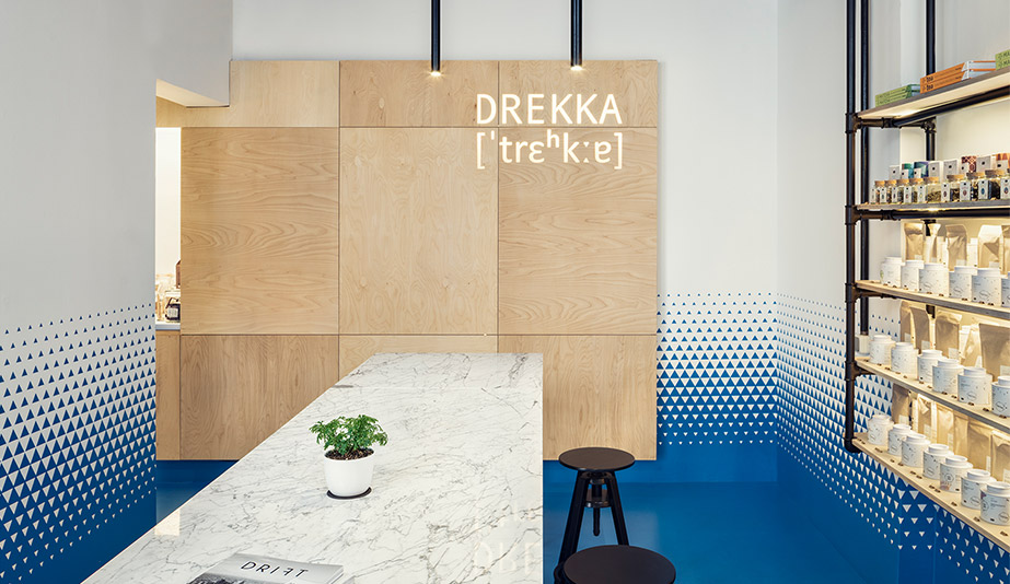
Anchoring the space is a solid blue floor – one sheet of commercial-grade PVC tailored to fit in the space without seams or visual breaks. This transitions up the walls through a customized vinyl application of gradated blue and white triangles, with the move from strong colour to neutral instilling vibrancy and interest. To further the effect, partnering materials were kept low-key and inviting, with a birch plywood panelled back wall, simple open shelving suspended from black powder-coated tubing and a massive Bianco Carrara tasting table.
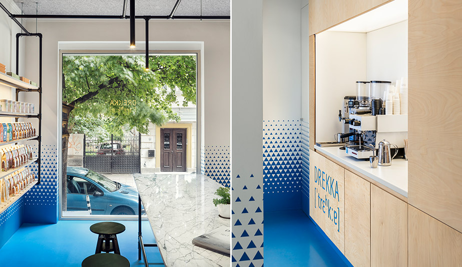
Custom black tubular lighting riffs on the shelving framework, which is also repeated as table legs for the marble slab. Restraining the materials to three main ingredients and focusing on one graphic element worked to provide the minimal space with “a comfortable human scale,” according to project architect and designer Antonina Ilieva.