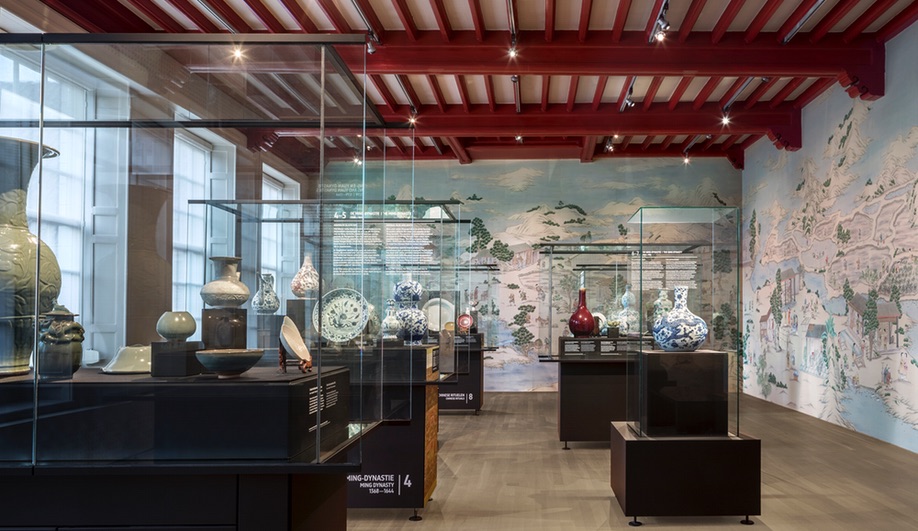
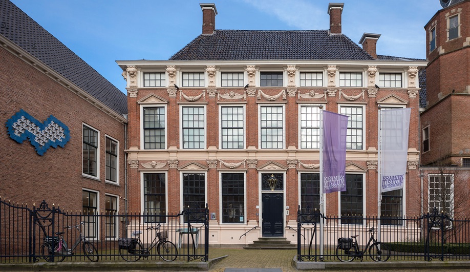
In December, the Netherlands’ Princessehof National Museum of Ceramics, in Leeuwarden, celebrated its 100th birthday by opening its refreshed home to the public. Renovated by Dutch studio i29 Interior Architects, the 18th-century palace that houses the institution was once the home of Maria Louise van Hessen-Kassel, Princess of Orange Nassau. It now exhibits a massive and diverse collection of Chinese porcelain, as well as a range of Dutch Art Deco and Art Nouveau ceramics, made between 1880 and 1930.
In order to bring the museum’s 1,200-square-foot interior into the 21st century, while still respecting the history of the building and its collections, i29 created a series of distinctive colour palettes, for amenity and exhibition spaces. Working with communications agency the Ambassadors of Aesthetic, the firm started by reshaping the entrance. Creating a singular circulation spine that joins the front and rear entrances, the studio made the museum more accessible and welcoming, while maintaining the minimalist aesthetic the firm is known for.
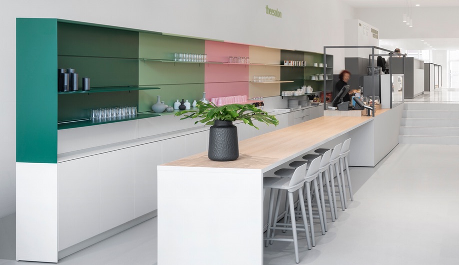
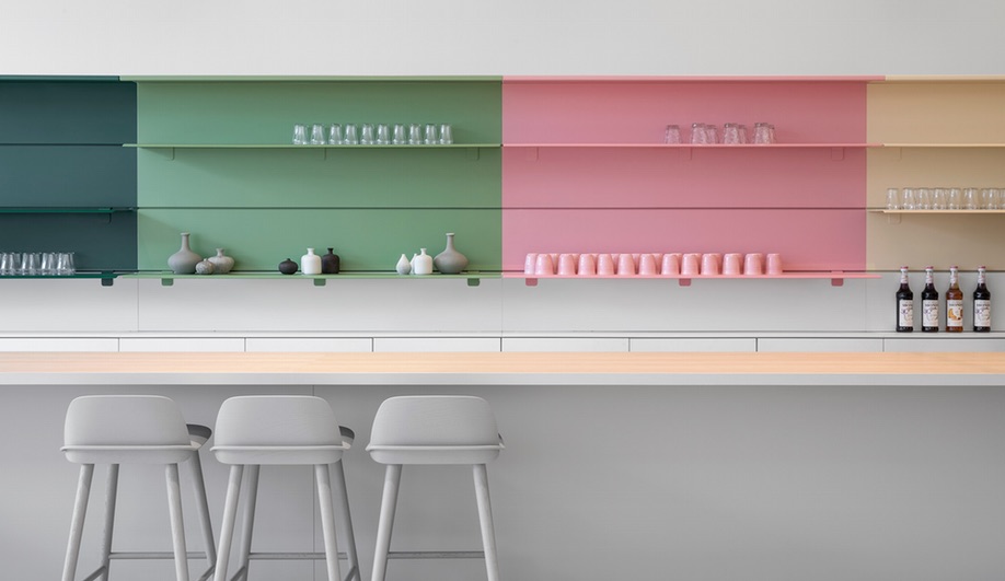
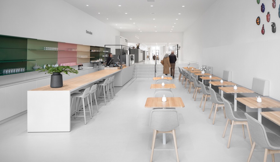
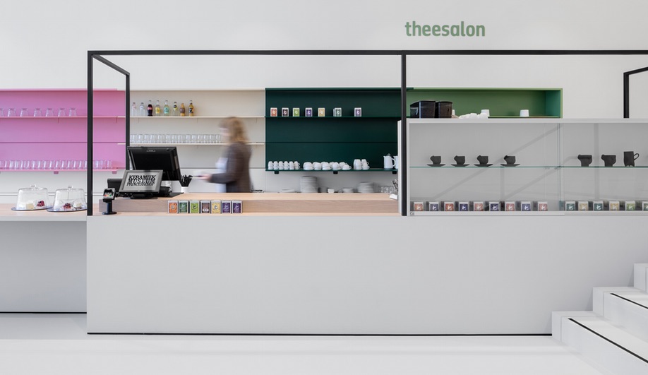
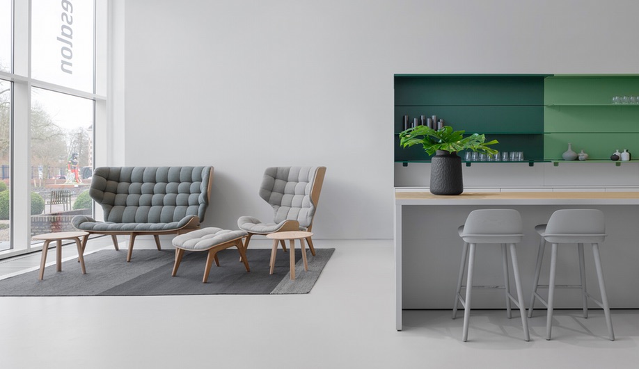
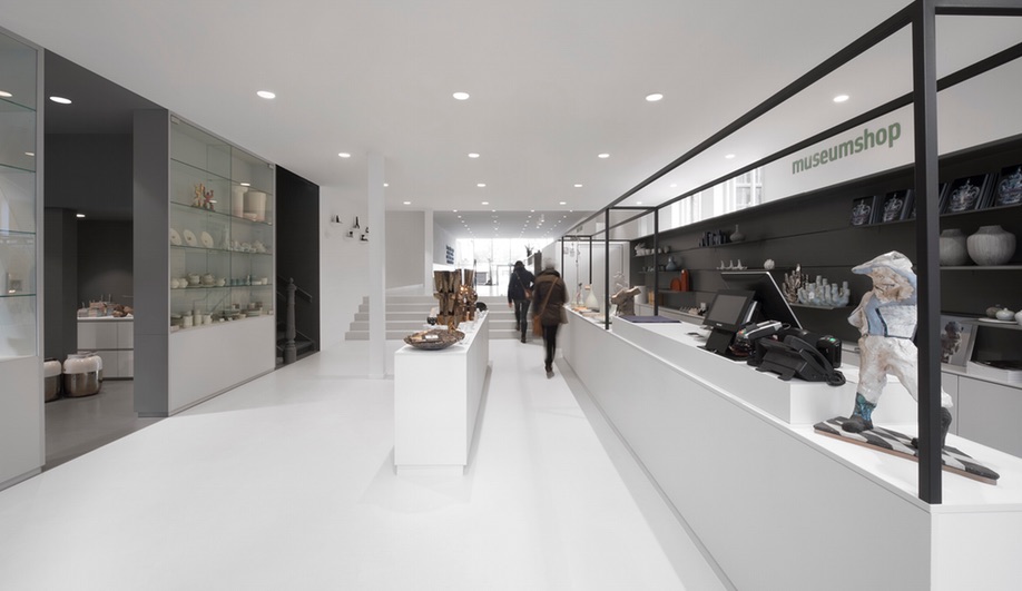
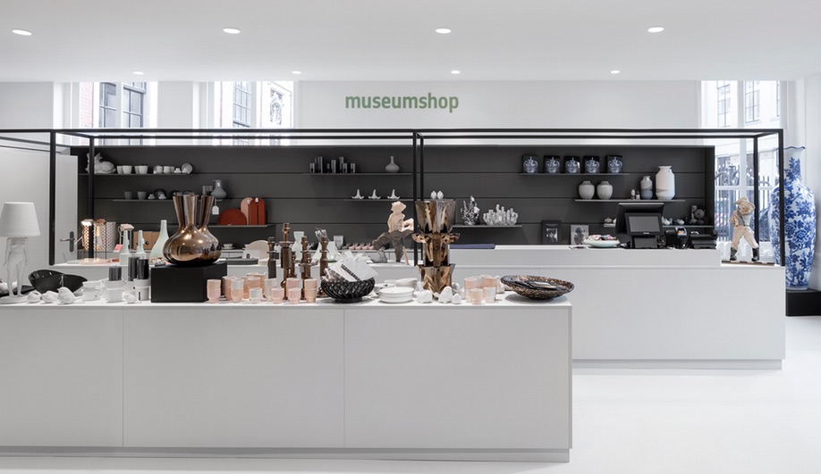
Visitors now enter, through either access point, into a long corridor, awash in natural light. As well as a front desk area, the foyer boasts a colourful tearoom, overlooking a garden terrace, and a gift shop. Though the floor drops down a level towards the garden, accessibility is maintained by tucking a ramp behind the tearoom’s colourful behind-counter storage shelves.
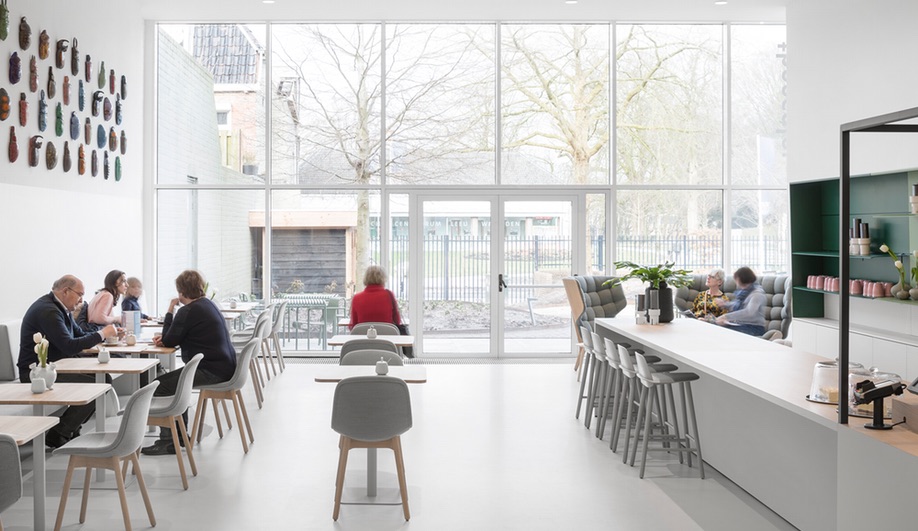
Looking down this long passageway, the recurring theme that ties the whole project together is clear: contrast. The tearoom is characterized by the fresh, spring-like palette of the colour-blocked storage wall, while the gift shop beyond is a muted grey. The grey serves as an ideal backdrop for product to pop against, while the bolder hues of the cafe beyond complements the garden in all seasons.
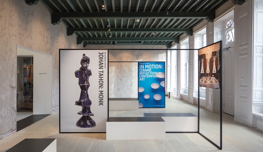
The “museum square” is a transition space that takes visitors from the modern entry spaces to the exhibition galleries. Wrapped in hand-painted wallpaper, which references the handcrafted antiquities of the museum’s collections, this area is filled with seating and info screens. Moving into the rooms beyond, a variety of tactics are deployed to show off the collection.
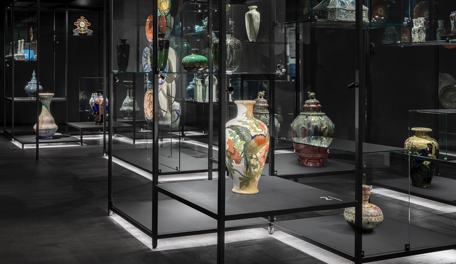
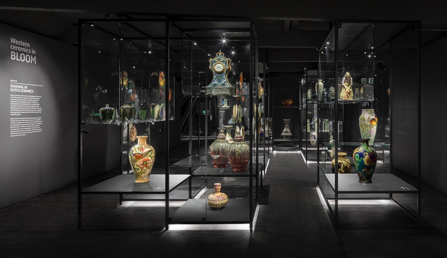
For instance, one room full of Art Nouveau examples is dressed floor to ceiling in black, with the ceramic works appearing to float midair, though they are actually stacked on black shelving units that sit atop back-lit lucite bases.
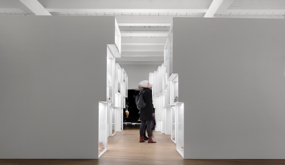
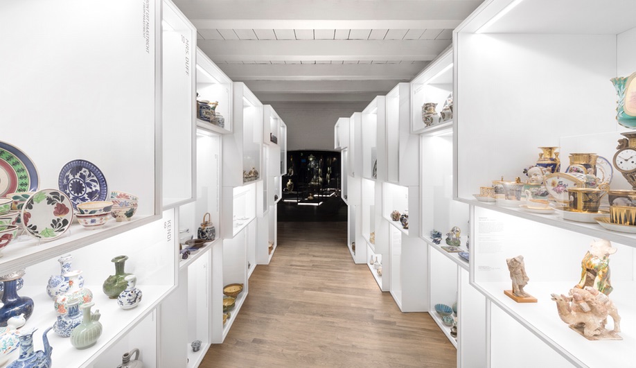
Meanwhile, the Mass Production collection is displayed in a hallway framed by staggered boxes. Individually lit, each stark white cube is jam-packed with colourful ceramics, a display technique that references the nature of their making.
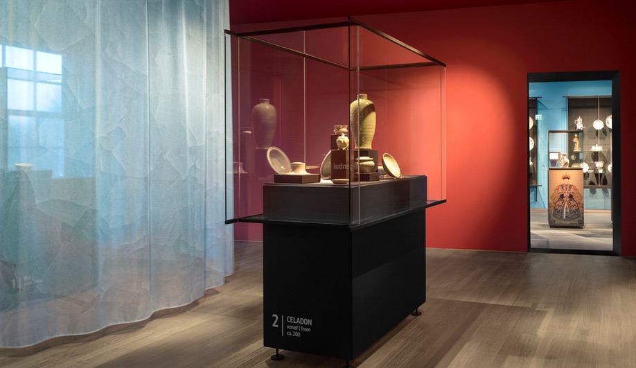
Research into the building’s past lead to some galleries being repainted in their historic colours, and it is, in fact, paint that does a lot of the heavy lifting in this low-budget project. “The pronounced simplicity of the design interventions contrasts with the monumental shell,” explain partners Jaspar Jansen and Jeroen Dellensen. “The contrast between old and new, and monumental and contemporary complements each other, and together they form a powerful and surprising whole. It places the monument back into the here and now.”