
Next year, the Summer Olympics will return to Tokyo for the first time since 1964. To welcome the games, the Japanese metropolis (which also hosted in 1940) is taking cues from its Olympic heritage, with a newly unveiled set of pictograms that pay homage to their 1964 predecessors, and a torch that combines Olympic themes of global unity with a nod to Japan’s iconic cherry blossoms.
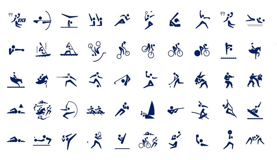
A team led by graphic designer Masaaki Hiromura created the pictograms representing all 33 sports that will feature in the 2020 Olympics. The designers crafted a total of 50 framed and free type pictograms – since some sports are represented more than once – which will be used on tickets, posters and promotional products, taking a prominent place across the Olympic village and the individual venues. Providing clear wayfinding and navigation, the simple pictograms also create a consistent — and easily recognizable – Olympic identity.
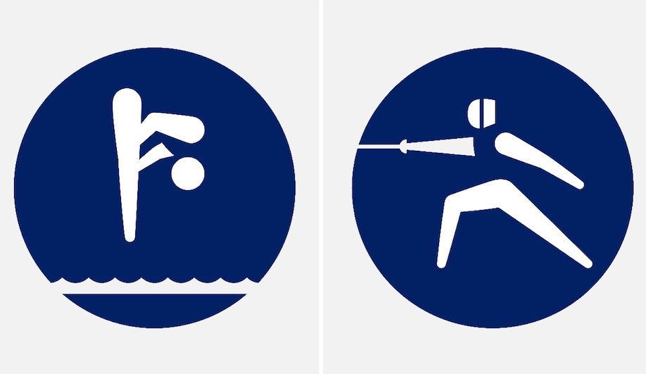
“The sports pictograms were officially used for the first time at the 1964 Tokyo Games; Japanese pioneering designers created this great legacy,” Hiromura told Reuters. “Having that as our starting point, for the Tokyo 2020 Games we wanted a more modern design, incorporating athletes’ dynamism and trying to express their muscle movements, yet keeping it simple.”
The minimalism of Hiromura’s designs creates a highly legible aesthetic, with a simple interplay of lines and angles used to represent each sport. For a global audience of athletes and visitors, the visuals speak a universal language. The need to communicate across linguistic barriers prompted the creation of the first Olympic pictograms – which were created by Masasa Katzumie and Yoshiro Yamashita – in 1964, with bespoke symbols created for every subsequent Olympic event.
The clean mid-century minimalism of Tokyo’s 1964 pictograms set a standard that has rarely been replicated. In the decades that followed, more stylized, abstracted, and elaborate designs graced the post-modern decades of the late 20th century, while more recent pictograms – such as Athens 2004 and Rio 2016 – have drawn aesthetic inspiration from the cultural history and geography of their host regions. For Tokyo 2020, the return to mid-century minimalism is itself a paean to history, celebrating the global influence of Japanese design.
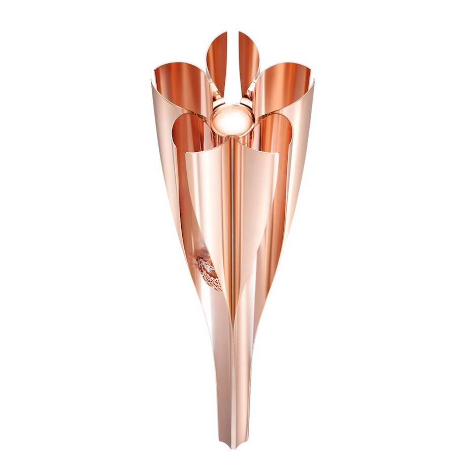
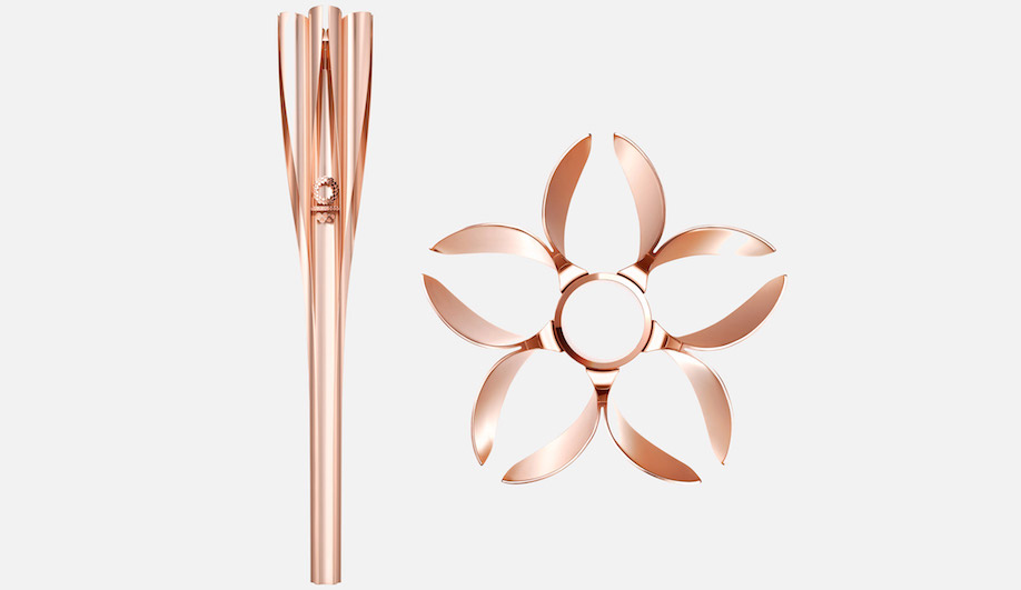
Meanwhile, as Kengo Kuma’s New National Stadium nears completion, the design for next years’ Olympic Torch has also been revealed. Created by Tokujin Yoshioka, the rose-gold torch is inspired by cherry blossoms, each of its five extruded sections representing a petal.
The torch is made from aluminum that was reclaimed from the materials used to build temporary emergency housing in the wake of 2011’s Great East Japan Earthquake and Fukushima nuclear disaster. The reclaimed aluminum has a symbolic significance, with the 71-centre torch representing a flower blooming from the debris of tragedy.
Although the design of the torch is noticeably more expressive than Hiromura’s pictograms, both convey a sense of pared down aesthetic balance. In their simplicity, the torch and pictograms offer a powerful tribute to Japan’s world-leading design culture.