


Like newspapers, movie theatres and other “old-school” institutions, department stores have struggled in recent years to maintain their relevance in a post-Internet world. Changing consumer habits and the rise of online retailing have proven to be existential threats to the once-dominant model of selling everything from underwear to appliances under a single roof. So how do these historic temples of consumerism adapt to the challenges of declining interest and potential redundancy? The successful ones use art, architecture and fanfare to make themselves pseudo-cultural destinations that also happen to sell neckties and negligees.

This at least has been the strategy of La Maison Simons, the 177-year-old Quebec-based fashion retailer that has been aggressively expanding across Canada at a time when many of its competitors are closing stores and reducing operations. Since 2012, the family-owned chain has opened six stores beyond the eight it already had in its home province, making conspicuous use of bold design and specially commissioned art to distinguish each location. For the new Simons department store in Calgary, the brand brought in local firm McKinley Burkart to devise an interior that adheres to that approach.

The first challenge tasked to the firm was to knit together two distinct spaces – five floors of the nine-storey, century-old Lancaster Building and three levels of the adjacent shopping complex called The CORE – into “a cohesive Simons experience.” A housewares department and a restaurant are among the store’s varied components. The main floor of the department store extends an entire city block along 2 Street SW.

At street level, a curved, “ribbon-like” floor-to-ceiling windowscape serves as both a calling card for the new store and a unifying architectural element, greeting visitors who enter from the sidewalks and providing visual continuity between the joined buildings.

Inside the multi-level store, a set of curving walnut stairs connects all five floors of the Lancaster component, from customer service on the lower level to the men’s departments on the fourth floor. Blackened steel chevron rails line the staircase, creating an elegant focal point.
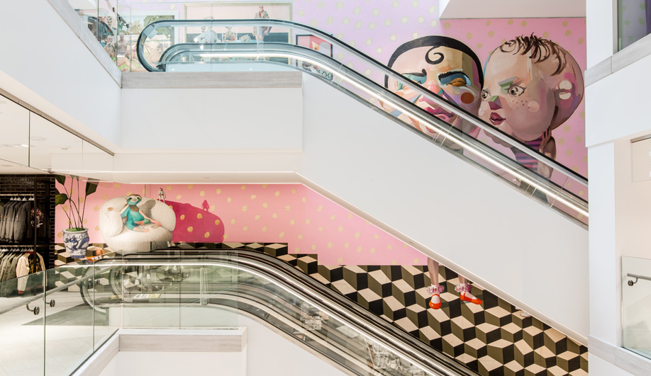
To provide the sense of locality and individuality that Simons aims for in each of its outlets, McKinley Burkart incorporated artisanal pieces, from graphic vinyl wallcoverings to yarn-wrapped panels, throughout the various departments. Perhaps the most spectacular addition is a vibrant three-storey mural by local artist Maya Gohill; called Funhouse, it runs along the escalators in the Lancaster Building. A dramatic skylight illuminates the asymmetrical opening from above.

Additional works of art – including a portrait (called Poet #2) by Chris Cran and a large graphic mural by Megan Jentsch – round out the bold interior-design strokes.