An innovation lab in Huizhou, China, and a media brand’s New York headquarters exploit colour to foster employee happiness and boost productivity.
A Healthy Glow
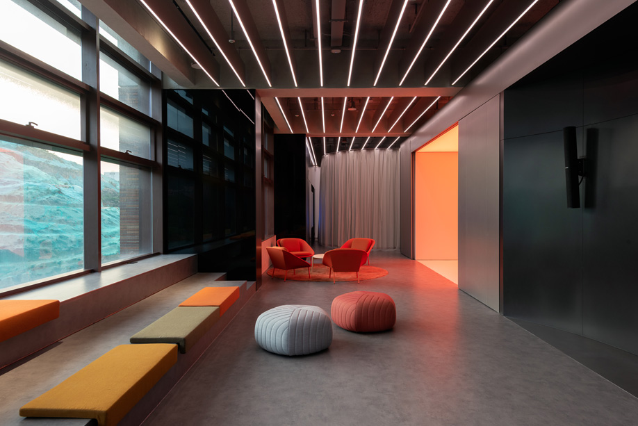
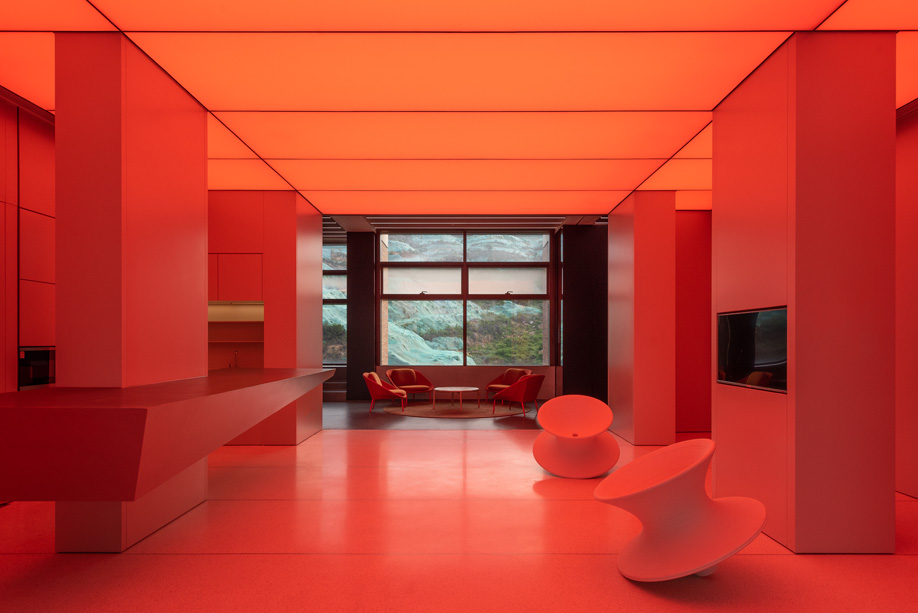
Colour has long been linked to enhancing mood and creativity. For the futuristic-looking Innovation Lab in the Chinese city of Huizhou, a 700-square-metre training and research hub for the China Resources Group, a conglomerate based in Hong Kong, a vibrant palette is just one aspect of the overall design, but it plays an important role in creating areas where employees feel welcome and relaxed. In the common kitchen and waiting lounge, collectively known as the “energy centre,” colour and light work in tandem to “affect the mood, motivation and energy of the lab’s employees,” says Aim Architecture principal Wendy Saunders, who, along with Vincent de Graaf, led the design.
In these areas, such elements as LED strips (mounted in aluminum acoustic fins in the exposed concrete ceiling) and a nearby interactive light screen emit a range of warm and cool hues – pink, blue, orange, white – to accommodate changing energy levels throughout the day.
Graphic Impact
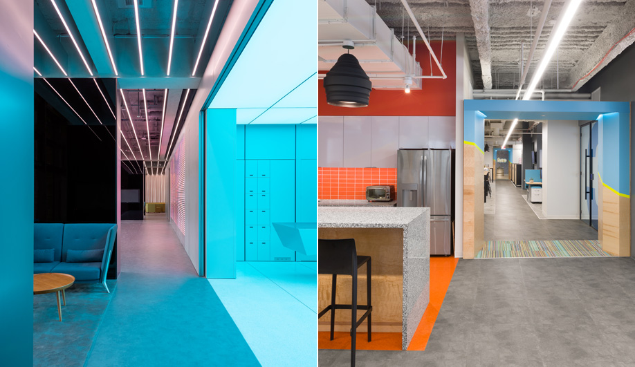
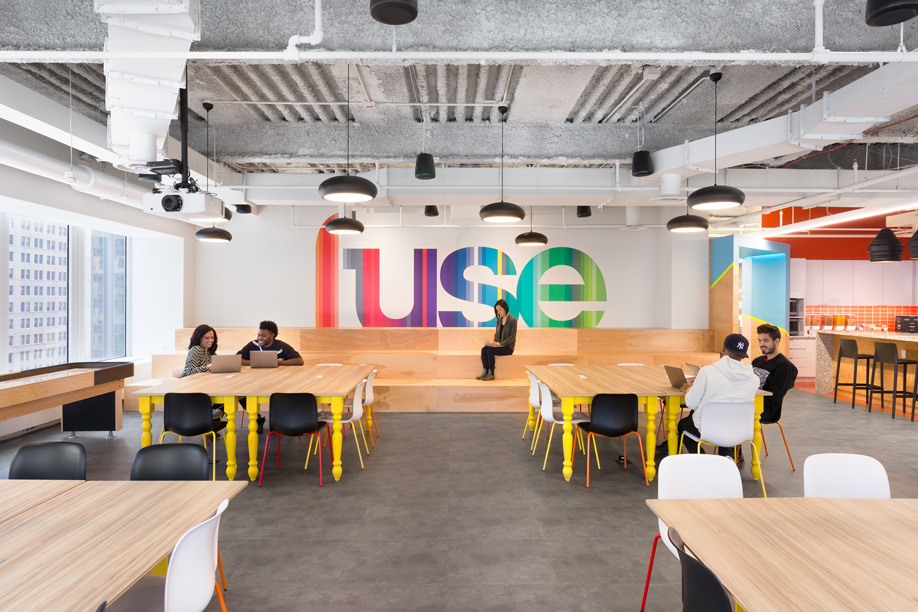
For Fuse, a New York City-based media brand that emphasizes inclusion and diversity, a traditional office layout was not a consideration when it came to devising its new headquarters. Rather, the aim was to create a space that reflected the company’s fluid and flexible spirit, one where employees could interact unhindered by a corporate set-up. But even the freest flowing of spaces needs some direction, which is where R&A Architecture + Design came in.
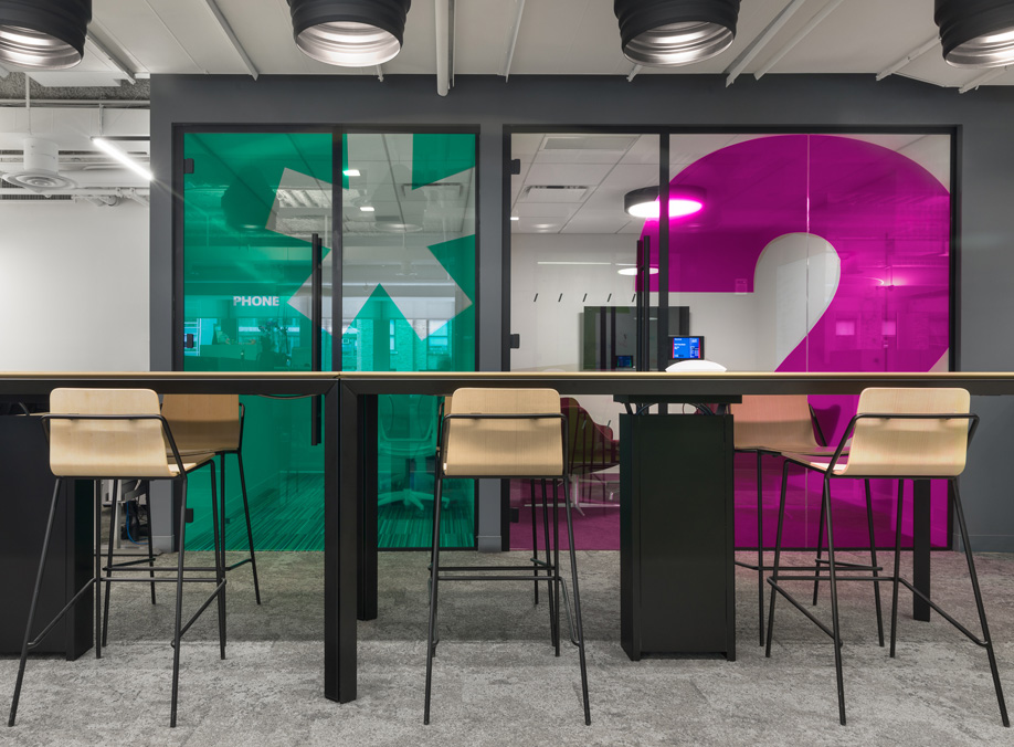
According to R&A principal and co-founder Christian Robert, departments were grouped in a way that allowed them to function hyper-specifically. “Colour,” he says, “was used to identify areas and to highlight flexible meeting spaces.” To that end, a bold palette was developed alongside new branding imagery and applied through visual cues. For example, semi-private rooms were positioned together within the space and feature glass walls with colourful symbols and numerals announcing the room’s intended purpose – anything from a single-user phone booth to a small-group conference space.
This story was taken from the November/December 2018 issue of Azure. Buy a copy of the issue here, or subscribe here.